Top 17 Gray Paint Colors for a Sophisticated Home

Overview
This article explores the top 17 gray paint colors, covering a diverse range from warm greiges to cool, crisp shades. Perfect for homeowners, designers, and DIY enthusiasts, you’ll discover how different grays can transform your space. Learn about undertones, lighting effects, and practical applications, gaining expert insights to choose the ideal gray for any room and achieve a sophisticated, timeless aesthetic with confidence.
Key Takeaways
- heading
- takeaways
- section_type
Choosing the perfect gray paint color can feel like a daunting task, given the vast spectrum of shades available. From the lightest whisper of smoke to deep, dramatic charcoal, gray offers unparalleled versatility and sophistication for any interior space. This timeless neutral provides a refined backdrop that complements virtually any decor style, allowing other elements in your room to truly shine.
In this comprehensive guide, you will discover 17 of the most beloved and highly recommended gray paint colors, each with its unique characteristics and ideal applications. We will explore their specific undertones, discuss how different lighting conditions can alter their appearance, and provide expert tips to help you select the precise hue that will elevate your home’s aesthetic. According to design experts at Benjamin Moore, gray remains a foundational choice for creating elegant and serene environments.
1. Sherwin Williams Repose Gray SW 7015

This contemporary living room showcases Sherwin Williams Repose Gray walls, a light gray sofa, and natural wood accents.
Repose Gray is a true greige, a perfect balance of gray and beige, which makes it incredibly versatile and popular. It features subtle warm undertones of brown and a hint of green, preventing it from appearing too cold or stark in any lighting condition. This inviting shade creates a soft, welcoming atmosphere that feels both modern and classic.
This color works beautifully in open concept spaces, living rooms, and bedrooms, providing a soothing backdrop. Its adaptability means it pairs well with both warm and cool decor elements, making it an excellent choice for a cohesive flow throughout your home. From designing hundreds of spaces, I have observed its consistent ability to create an airy, sophisticated feel.
2. Sherwin Williams Agreeable Gray SW 7029

A traditional dining room featuring Sherwin Williams Agreeable Gray walls, a dark wood table, and cream chairs.
Agreeable Gray is another highly sought after greige, slightly warmer than Repose Gray, leaning more towards beige. It possesses delicate warm undertones that ensure it never looks cold, even in north facing rooms with cooler light. This hue offers a soft, muted appearance that is incredibly inviting and comfortable.
This shade is ideal for creating a cozy, inviting atmosphere in family rooms, dining areas, and hallways. Its warmth makes it a fantastic choice for homes seeking a timeless and classic look without feeling dated. Design experts at Sherwin Williams note its enduring popularity for its ability to harmonize with a wide range of furnishings.
3. Sherwin Williams Accessible Beige SW 7036

This bright kitchen features Sherwin Williams Accessible Beige walls, white shaker cabinets, and a light wood island.
Accessible Beige is a warm greige that leans more distinctly into the beige spectrum, yet still retains a subtle gray influence. It is a fantastic option for those who want the warmth of beige but with the modern feel of gray, avoiding any yellow or pink undertones often associated with traditional beiges. This color is light, airy, and exceptionally welcoming.
This shade is perfect for living rooms, bedrooms, and even kitchens where a soft, warm neutral is desired. It pairs beautifully with natural wood tones, crisp white trim, and a variety of accent colors, creating an inviting and cohesive space. My personal observations confirm its ability to make a room feel cozy and bright simultaneously.
4. Sherwin Williams Light French Gray SW 0055

A contemporary home office with Sherwin Williams Light French Gray walls, a minimalist desk, and a modern chair.
Light French Gray is a beautiful medium gray with a clean, cool undertone, often appearing as a true gray without strong blue or green influences. It has a crispness that adds sophistication without feeling cold or stark, especially when balanced with warm accents. This color offers a refined and elegant appeal.
It is an excellent choice for creating a sophisticated ambiance in living rooms, offices, and even exterior applications. Its clean nature makes it suitable for modern, contemporary, and transitional design styles. Pair it with bright white trim for a striking contrast and a very polished look.
5. Sherwin Williams On the Rocks SW 7671

This serene bedroom features Sherwin Williams On the Rocks walls, a white upholstered headboard, and crisp white bedding.
On the Rocks is a light to medium gray with a slight warm undertone, providing a beautiful balance between cool and warm. It often reads as a very true, sophisticated gray, making it a reliable choice for many different spaces. This hue avoids strong colorful undertones, offering a clean and crisp aesthetic.
This color is fantastic for bedrooms, bathrooms, and living areas where you want a clean, neutral backdrop that feels fresh. Its subtle warmth makes it comfortable, while its gray base maintains a modern edge. It pairs well with both traditional and contemporary furnishings, offering great versatility.
6. Sherwin Williams Dorian Gray SW 7017

An elegant dining room showcasing Sherwin Williams Dorian Gray walls, a dark wood table, and velvet upholstered chairs.
Dorian Gray is a medium to dark gray that carries a noticeable warm, earthy undertone, giving it a rich and grounding presence. It is a more saturated gray than some lighter options, offering depth without being overly dramatic. This color creates a cozy and enveloping feeling.
This shade is excellent for creating a more intimate or dramatic mood in spaces like dining rooms, studies, or accent walls. It works wonderfully in transitional and traditional settings, complementing dark wood furniture and metallic accents. My experience suggests it provides a luxurious and sophisticated atmosphere.
7. Sherwin Williams Gauntlet Gray SW 7019

This sophisticated home office features Sherwin Williams Gauntlet Gray walls, dark wood built in bookshelves, and a leather armchair.
Gauntlet Gray is a deep, dramatic dark gray with strong warm undertones, often appearing as a rich charcoal with hints of brown or olive. It is a bold choice that creates striking contrast and adds significant depth to a room. This color exudes sophistication and strength.
This shade is perfect for accent walls, cabinetry, or an entire room where a powerful, moody atmosphere is desired, such as a home theater or a sophisticated study. It pairs beautifully with lighter grays, crisp whites, and natural textures like wood and leather. This style has grown significantly in popularity for creating impactful design statements.
8. Benjamin Moore Gray Owl OC 52

A modern bathroom showcasing Benjamin Moore Gray Owl walls, a white vanity with marble, and chrome fixtures.
Gray Owl is a light, cool gray with subtle green and blue undertones that become more apparent in certain lighting conditions. It is a very fresh and airy color, making spaces feel larger and brighter, especially when ample natural light is present. This hue offers a clean, crisp, and contemporary aesthetic.
It is an excellent choice for bathrooms, kitchens, and living rooms where a light, modern, and clean look is desired. Gray Owl pairs beautifully with white trim, chrome fixtures, and natural materials, contributing to a calm and serene environment. It is a favorite among designers for its ability to brighten a space without feeling sterile.
9. Benjamin Moore Revere Pewter HC 172

A spacious living room featuring Benjamin Moore Revere Pewter walls, a cream sofa, and a dark wood coffee table.
Revere Pewter is arguably one of the most famous and beloved greige paint colors, known for its perfect balance between gray and beige. It has a slight warm undertone that prevents it from feeling cold, making it incredibly adaptable to various lighting situations and existing decor. This color creates a timeless and elegant foundation for any room.
This versatile shade is fantastic for almost any room in the house, from living areas to kitchens and bedrooms, providing a sophisticated neutral backdrop. It works well with both warm and cool color palettes, making it a safe yet stylish choice for homeowners looking for a reliable, inviting hue. Its LRV allows it to reflect light beautifully without washing out.
10. Benjamin Moore Edgecomb Gray HC 173

This cozy bedroom features Benjamin Moore Edgecomb Gray walls, a light wood bed frame, and soft white bedding.
Edgecomb Gray is a very light, warm greige that leans more towards beige, offering a softer, creamier alternative to Revere Pewter. It has a beautiful, subtle warmth that makes a room feel incredibly inviting and cozy without being overtly yellow or brown. This hue provides a gentle, airy quality.
This color is ideal for creating a soft, serene atmosphere in bedrooms, nurseries, or any space where a subtle, warm neutral is desired. It pairs wonderfully with crisp white trim, light wood furniture, and pastel accent colors, contributing to a calm and inviting environment. Its high LRV helps to brighten rooms, especially those with less natural light.
11. Benjamin Moore Stonington Gray HC 170

A modern laundry room showcasing Benjamin Moore Stonington Gray walls, white cabinets, and a light wood countertop.
Stonington Gray is a classic, medium toned cool gray with noticeable blue undertones, giving it a crisp and clean appearance. It is a straightforward gray that avoids looking dull, offering a refreshing and sophisticated feel. This color is popular for its ability to create a sense of calm and order.
This shade is well suited for spaces where you want a fresh, modern, and slightly formal look, such as bathrooms, laundry rooms, or contemporary living areas. It pairs beautifully with white, navy, and darker grays, enhancing a sophisticated color scheme. Be mindful of its cool undertones in north facing rooms, as it can appear cooler there.
12. Benjamin Moore Pale Oak OC 20

This bright open concept living space features Benjamin Moore Pale Oak walls, a cream sectional sofa, and large windows.
Pale Oak is an exceptionally light greige, almost appearing as a warm off white in many lighting conditions, with very subtle pink or violet undertones. It offers a soft, ethereal quality that brightens a room while still providing more depth than a pure white. This color is incredibly elegant and airy.
This shade is perfect for creating a bright, open, and sophisticated atmosphere throughout an entire home, especially in open concept layouts. It works beautifully with natural materials, light wood floors, and crisp white trim, creating a serene and inviting space. My clients often gravitate towards this shade for its understated elegance and ability to make rooms feel spacious.
13. Benjamin Moore Balboa Mist OC 27

A serene nursery showcasing Benjamin Moore Balboa Mist walls, a white crib, and a comfortable glider chair.
Balboa Mist is a delicate, light greige that leans slightly more towards gray than beige, often revealing subtle violet or pink undertones in certain lights. It is a soft and refined color that provides a sophisticated backdrop without feeling cold or overwhelming. This hue creates a gentle and calming ambiance.
This shade is ideal for bedrooms, nurseries, and bathrooms where a serene and elegant atmosphere is desired. It pairs wonderfully with white, muted blues, and soft pinks, creating a cohesive and tranquil color scheme. Its versatility makes it a popular choice for transitional design styles.
14. Benjamin Moore Chelsea Gray HC 168

An elegant study featuring Benjamin Moore Chelsea Gray walls, a dark wood desk, and a comfortable leather armchair.
Chelsea Gray is a rich, deep, and sophisticated warm gray that holds its own as a commanding neutral. It has strong brown and green undertones, preventing it from appearing too stark or cold, instead offering a grounded and luxurious feel. This color creates a dramatic yet inviting mood.
This shade is excellent for creating a statement in a study, a formal dining room, or as an accent wall in a living space. It pairs beautifully with dark wood furniture, metallic accents like brass or gold, and crisp white trim for a striking contrast. It is a fantastic choice for adding depth and elegance to any room.
15. Benjamin Moore Coventry Gray HC 169

This modern bedroom showcases Benjamin Moore Coventry Gray walls, a platform bed with dark gray bedding, and minimalist nightstands.
Coventry Gray is a beautiful medium to dark cool gray with distinct blue undertones, offering a crisp and somewhat masculine feel. It is a strong, saturated gray that creates a powerful statement without being overwhelming. This color provides a sophisticated and clean aesthetic.
This shade is well suited for modern and industrial inspired spaces, studies, or bedrooms where a calm yet impactful color is desired. It pairs effectively with white, navy, and darker wood tones, creating a cohesive and refined look. From my observations, it is particularly effective in spaces with ample natural light to bring out its cool crispness.
16. Farrow and Ball Elephant’s Breath No. 229

An elegant living room featuring Farrow and Ball Elephant’s Breath walls, a cream sofa, and a gold framed mirror.
Elephant’s Breath is a warm, mid toned gray with a unique magenta undertone that becomes more apparent in certain lighting, particularly south facing rooms. It is a sophisticated and highly nuanced color that can shift between a soft gray and a muted lilac, offering incredible depth. This hue provides a gentle, romantic feel.
This shade is excellent for creating a subtle, elegant, and unique atmosphere in bedrooms, living rooms, or dining areas. It pairs beautifully with other muted tones, natural wood, and brushed brass accents, contributing to a refined and inviting space. Its distinctive character makes it a favorite for those seeking a gray with more personality.
17. Benjamin Moore Classic Gray OC 23
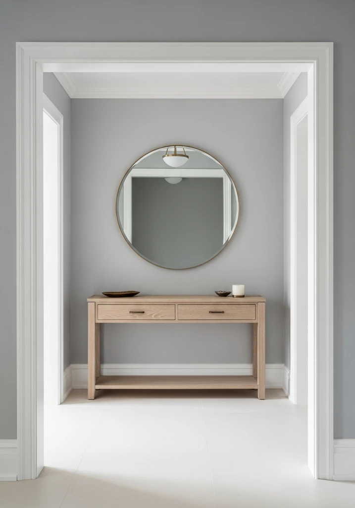
A bright entryway showcasing Benjamin Moore Classic Gray walls, a light wood console table, and a round mirror.
Classic Gray is a very light, almost off white gray with extremely subtle warm undertones, often appearing as a soft, ethereal gray. It is a delicate and airy color that provides a gentle wash of warmth without committing to a strong hue. This shade is perfect for those who want a hint of gray without sacrificing brightness.
This color is ideal for creating a bright, clean, and spacious feel in any room, especially where you want a neutral backdrop that is brighter than a traditional greige. It pairs beautifully with crisp white trim, light furniture, and virtually any accent color, offering maximum versatility. My experience shows it is an excellent choice for a whole house color scheme, creating a seamless flow.
Design Comparison: What to Expect
| Style/Type | Key Features | Best For |
|---|---|---|
| Warm Greige | Mix of gray and beige, subtle warm undertones, soft and inviting | Open concept spaces, living rooms, bedrooms, north facing rooms |
| Cool Gray | Blue or green undertones, crisp, clean, modern, and refreshing | Bathrooms, kitchens, modern offices, contemporary aesthetics |
| Light Gray | High LRV, airy, bright, expands space, subtle hint of color | Small rooms, whole house color schemes, minimalist and Scandinavian styles |
| Dark Gray | Deep, saturated, dramatic, rich, creates intimacy and sophistication | Accent walls, studies, formal dining rooms, bedrooms, industrial or glam styles |
| Nuanced Gray | Unique undertones (e.g., violet, pink), complex, shifts with light | Bedrooms, living rooms, spaces desiring unique character and depth |
How to Choose Your Perfect Gray Paint Color
Begin your selection process by considering the existing elements in your room, such as flooring, furniture, and natural light exposure. A north facing room typically receives cooler light, which can make cool grays appear even colder, so a warmer greige might be a better choice. Conversely, a south facing room with abundant warm light can temper cooler grays, making them feel balanced.
Next, pay close attention to the undertones of the gray paint colors you are considering. Grays can have blue, green, purple, or even brown undertones, and these will become more apparent when painted on a larger surface. Hold paint swatches against your existing finishes and observe them at different times of day to see how they interact with your home’s fixed elements.
Always, always sample your chosen paint colors directly on your walls or on large poster boards. Paint large swatches in several areas of the room, including corners and near windows, to observe how the color changes throughout the day and under both natural and artificial light. This crucial step will save you from making a costly mistake and ensure your chosen hue truly complements your space.
Common Mistakes to Avoid When Choosing Gray Paint
One common mistake is choosing a gray based solely on a small paint chip in a store, without considering how it will look in your home’s unique lighting. Store lighting is often very different from residential lighting, which can drastically alter how a color appears on your walls. Always take samples home and observe them in your actual space.
Another frequent error is neglecting the undertones, which can lead to a gray that clashes with your existing decor. A gray with strong blue undertones might look icy next to warm wood tones, or a gray with green undertones could appear muddy if not carefully coordinated. Understanding these subtle hues is critical for a harmonious color scheme.
Failing to consider the room’s orientation and natural light is a significant oversight. A beautiful cool gray might feel too stark in a north facing room that receives minimal warm light, while a warm greige could feel too yellow in a south facing room flooded with bright sunshine. Always match the gray’s warmth or coolness to the light it will receive.
Lastly, painting an entire room without testing a larger swatch is a mistake that many homeowners regret. A color can look perfect on a small card but overwhelming or underwhelming on all four walls. Invest in sample pots and paint large areas to truly visualize the final effect before committing to gallons of paint.
Frequently Asked Questions
What is the difference between a warm gray and a cool gray?
A warm gray, often called greige, has beige, brown, or sometimes subtle pink undertones, making it feel cozy and inviting. A cool gray, on the other hand, contains blue, green, or purple undertones, creating a crisp, fresh, and sometimes more modern feel. The surrounding light and other elements in the room will influence how these undertones are perceived.
How does lighting affect gray paint colors?
Lighting significantly impacts how gray paint colors appear, often altering their undertones. Natural light from a north facing window tends to be cooler and can enhance blue or green undertones, while south facing light is warmer and can bring out beige or red undertones. Artificial light, such as incandescent bulbs, can also cast a warm glow, whereas LED lights can be cooler or warmer depending on their Kelvin temperature.
Should I use the same gray paint color throughout my entire home?
Using the same gray paint color throughout an open concept home can create a cohesive and flowing feel, promoting a sense of calm and spaciousness. However, for rooms with distinct purposes or different lighting conditions, varying shades of gray or even different colors can add character and define spaces. Always consider the mood you wish to create in each individual room.
What trim color pairs best with gray walls?
Crisp white trim is a classic and highly recommended choice to pair with gray walls, as it provides a clean contrast that makes the gray pop and defines the architectural details. Off white or creamy trim can also work beautifully with warmer grays or greiges, creating a softer, more traditional look. The key is to select a trim color that complements the gray’s undertones.
Conclusion
Choosing the right gray paint color can truly transform your home, infusing it with sophistication, versatility, and a timeless appeal. By understanding undertones, carefully considering your home’s unique lighting, and utilizing sampling techniques, you are well equipped to make an informed decision. The perfect gray shade will serve as a beautiful foundation, allowing your personal style and decor to shine. Embrace the subtle nuances of gray to create spaces that are both inviting and effortlessly elegant.