
The Ultimate Guide to 17 Serene Light Blue Paint Colors for Your Home
Overview
This article explores the top 17 light blue paint colors, covering their unique undertones and ideal applications. Perfect for homeowners and interior design enthusiasts, you will discover how to select the perfect tranquil hue to transform any room. Get expert insights to create a serene and refreshing feel in your living spaces with confidence and style.
Key Takeaways
- Light blue paint offers versatility, ranging from soft sky blues to muted blue-greens and gray-blues.
- Understanding undertones is crucial as they significantly impact how a light blue color appears in different lighting conditions.
- Testing paint swatches directly in your space is essential to see how colors react to natural and artificial light.
- Light blue can create a calming, refreshing, or sophisticated atmosphere depending on its specific shade and complementary colors.
- Consider the room’s function and existing decor to ensure your chosen light blue paint enhances the overall aesthetic.
Light blue paint colors possess an undeniable charm, offering a tranquil hue that can transform any room into a serene retreat. These versatile shades evoke feelings of calm, freshness, and openness, making them a popular choice for creating a peaceful home environment. From coastal-inspired spaces to modern minimalist interiors, the right light blue can elevate your design with its inherent beauty and calming effect.
In this comprehensive guide, we will delve into 17 of the most exquisite light blue paint colors available, providing expert insights and practical advice for each one. You will discover their unique characteristics, ideal applications, and how to choose the perfect shade to complement your home’s aesthetic, ensuring a sophisticated palette for your design aspirations.
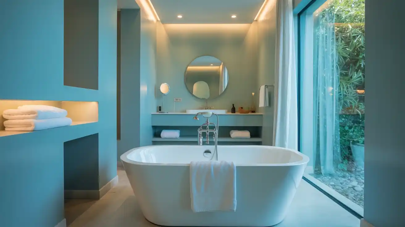
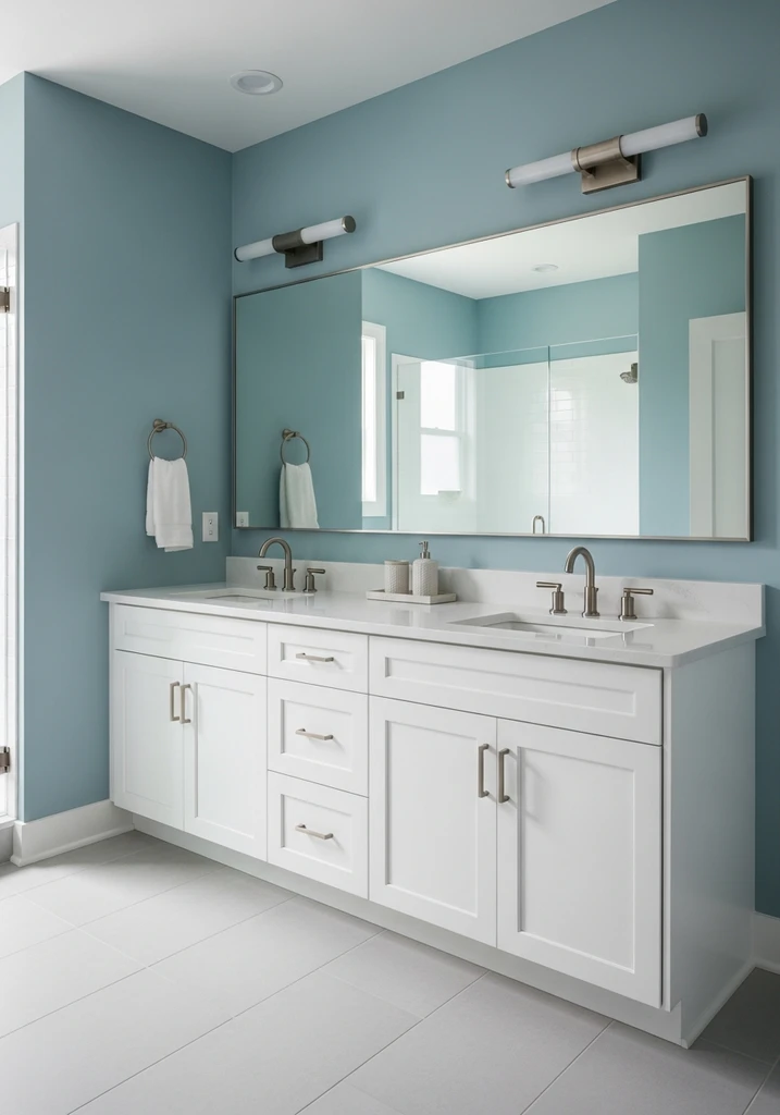
1. Benjamin Moore Palladian Blue HC-144
This elegant bathroom showcases walls painted in Palladian Blue, a white freestanding tub, and a light wood vanity for a serene atmosphere.
Palladian Blue is a beloved classic, known for its beautiful balance of blue, green, and gray undertones, creating a soft, spa like ambiance. This tranquil hue has a remarkable ability to shift with the light, appearing more blue in some conditions and more green in others, adding dynamic visual interest to a space. It is a harmonious shade that consistently delivers a refreshing feel, making it a favorite among interior designers.
This versatile shade is ideal for bathrooms, bedrooms, and living rooms, where a calming effect is desired. Pair it with crisp white trim for a fresh look or with natural wood tones for a more organic, earthy feel. According to Benjamin Moore, its historical appeal makes it suitable for both traditional and transitional designs.
2. Sherwin Williams Sea Salt SW 6204
A cozy bedroom features walls painted in Sea Salt, a white upholstered bed, and light wood nightstands, creating a tranquil hue.
Sea Salt is a highly popular and versatile shade, renowned for its soft, muted quality that leans heavily into green-gray undertones with a hint of blue. It is a chameleon color that subtly changes its appearance throughout the day, often looking more green in bright light and more blue-gray in softer light. This refreshing feel makes it a go-to for creating a relaxed atmosphere.
This sophisticated palette works wonderfully in almost any room, from kitchens to laundry rooms and especially bedrooms, due to its calming effect. It pairs beautifully with natural textures, white, and light wood, creating a coastal vibe or a modern farmhouse aesthetic. Design experts at Sherwin-Williams often recommend it for its broad appeal and soothing nature.
3. Benjamin Moore Healing Aloe 1562
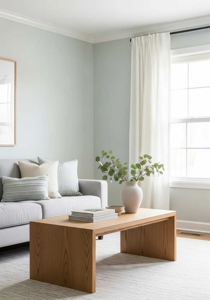
A bright living room features walls painted in Healing Aloe, complemented by a light gray sofa and natural wood coffee table.
Healing Aloe is an incredibly soft and ethereal shade, often described as an almost white with a delicate whisper of green and blue. It is an understated color that brings a very gentle and calming presence to a room, making it feel airy and expansive. This tranquil hue is perfect for those seeking a subtle touch of color without overwhelming the space.
This light and refreshing shade is excellent for open concept living areas, bedrooms, or nurseries where a soft, serene atmosphere is desired. It pairs beautifully with other pastels, grays, and natural materials, enhancing a minimalist or Scandinavian design. Its subtle nature ensures it never feels cold, only peaceful and inviting.
4. Sherwin Williams Rainwashed SW 6211
This modern bathroom features walls painted in Rainwashed, a white double vanity, and brushed nickel fixtures, offering a refreshing feel.
Rainwashed is a slightly more saturated version of Sea Salt, presenting a clear blue-green that still retains a soft, muted quality. It offers a fresh and invigorating feel, reminiscent of clear skies after a gentle rain, yet it remains incredibly calming. This color has just enough depth to hold its own without feeling too pale.
This versatile shade is fantastic for creating a sophisticated palette in bathrooms, sunrooms, or coastal themed living spaces. It works well with dark wood accents for contrast or with bright whites for a crisp, clean aesthetic. Its refreshing feel is perfect for bringing the outdoors in, creating a natural and inviting environment.
5. Benjamin Moore Beach Glass 1564
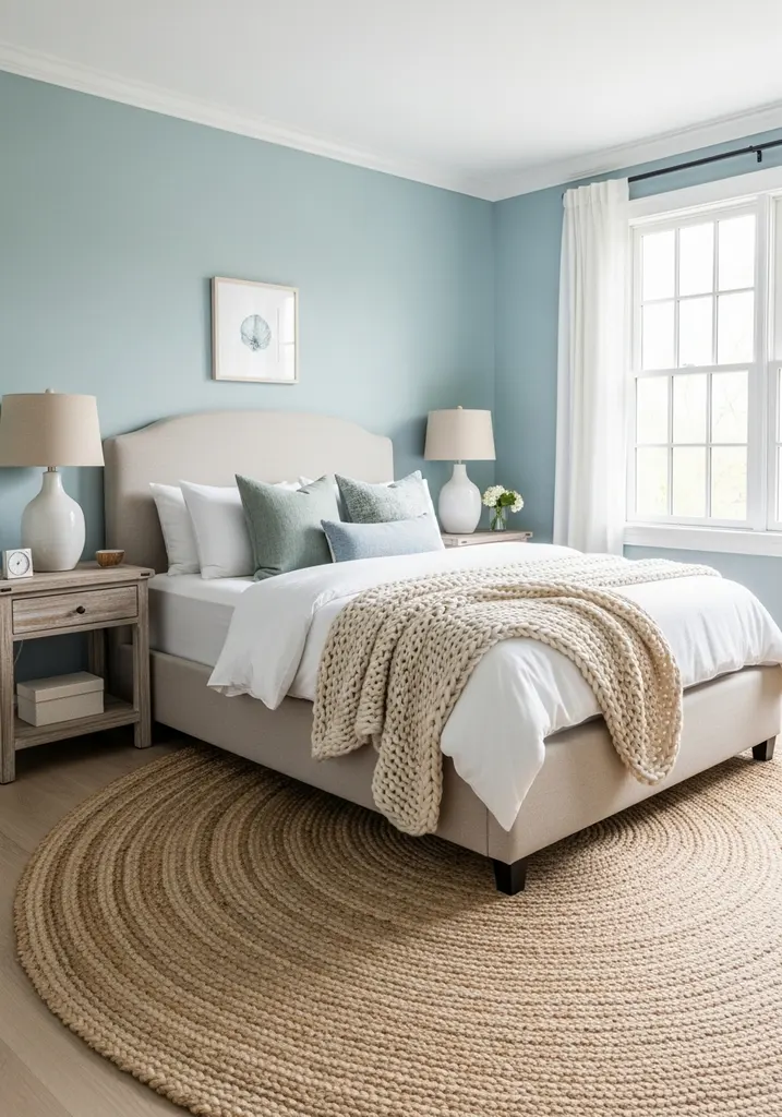
A coastal-inspired bedroom features walls painted in Beach Glass, a linen upholstered bed, and natural fiber accents for a tranquil hue.
Beach Glass offers a deeper, more pronounced blue-green-gray, embodying the serene atmosphere of a tranquil ocean shore. It is a beautiful mid-tone shade that provides more depth than lighter blues but still feels incredibly airy and peaceful. This color is perfect for those seeking a coastal vibe with a bit more presence.
This shade is particularly effective in bedrooms, dining rooms, or home offices where a focused yet calming environment is desired. It pairs wonderfully with sandy neutrals, distressed woods, and textured fabrics to enhance its natural, organic feel. Its sophisticated palette works well in both relaxed and more formal settings, adapting beautifully to various design styles.
6. Sherwin Williams Quietude SW 6212
This serene bedroom features walls painted in Quietude, a dark wood bed frame, and crisp white bedding for a calming effect.
Quietude is a beautiful, tranquil blue-green with a noticeable hint of gray, creating a sophisticated and deeply calming presence. It is a color that encourages relaxation and introspection, making it an excellent choice for personal retreats within the home. This shade provides a serene atmosphere without being overly saturated.
This versatile shade is perfectly suited for bedrooms, meditation rooms, or spa like bathrooms where a sense of peace is paramount. It harmonizes with dark wood furniture for a grounding effect or with soft whites and creams for an airy feel. Its refreshing feel contributes to a sophisticated palette that remains inviting and restful.
7. Benjamin Moore Nantucket Fog AC-22
An elegant living room showcases walls in Nantucket Fog, a cream sofa, dark wood coffee table, and subtle brass accents.
Nantucket Fog is a sophisticated and muted blue-gray, offering a soft, atmospheric quality that is both subtle and impactful. It has a beautiful depth that prevents it from feeling flat, creating a serene atmosphere that is slightly more serious than a bright sky blue. This color provides a refined backdrop for various design elements.
This tranquil hue is an excellent choice for living rooms, dining rooms, or home offices where you desire a calm yet elegant sophisticated palette. It pairs well with both warm and cool tones, making it incredibly adaptable; consider combining it with deep greens or rich browns. Its versatility allows it to bridge traditional and contemporary styles with ease.
8. Sherwin Williams Upward SW 6239
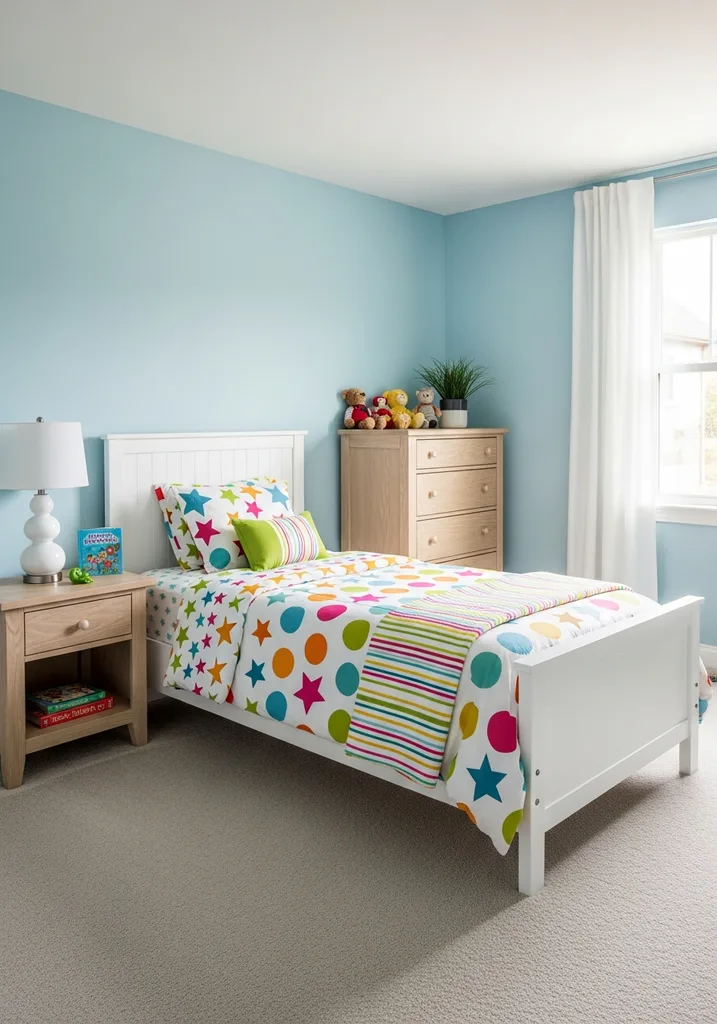
A bright child’s bedroom features walls painted in Upward, a white twin bed, and colorful patterned bedding for a cheerful space.
Upward is a clear, light, and airy sky blue that truly lives up to its name, evoking feelings of expansiveness and optimism. It has very little gray or green, making it a true blue that feels crisp and refreshing. This color is perfect for brightening up a space and creating a cheerful ambiance.
This refreshing feel is ideal for children’s rooms, playrooms, or even a bright laundry room, bringing a sense of cleanliness and joy. It pairs wonderfully with white, bright yellows, or even soft coral accents for a vibrant yet harmonious look. Its straightforward blue tone makes it an easy color to work with for a consistently uplifting mood.
9. Benjamin Moore Breath of Fresh Air 806
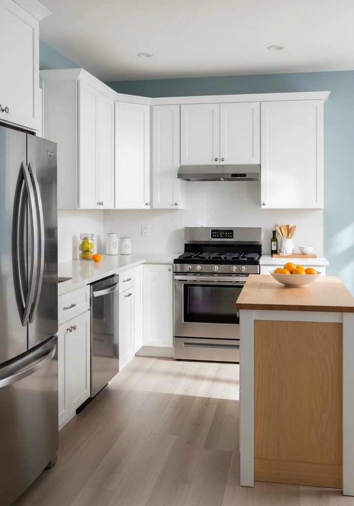
A clean kitchen features walls painted in Breath of Fresh Air, white shaker cabinets, and a light wood island, offering a refreshing feel.
Breath of Fresh Air is a clean, crisp light blue that feels invigorating and pure, true to its evocative name. It is a bright, clear blue with minimal undertones, making it a very straightforward and uplifting choice. This color creates an immediate sense of openness and tranquility, perfect for refreshing any interior.
This sophisticated palette is excellent for kitchens, bathrooms, or any room where you want to instill a sense of cleanliness and calm. It pairs beautifully with white cabinetry and chrome fixtures for a classic, timeless look or with natural textures for a more relaxed, coastal vibe. Its refreshing feel is consistently inviting, making it a popular choice for bright, airy spaces.
10. Sherwin Williams Misty SW 6232
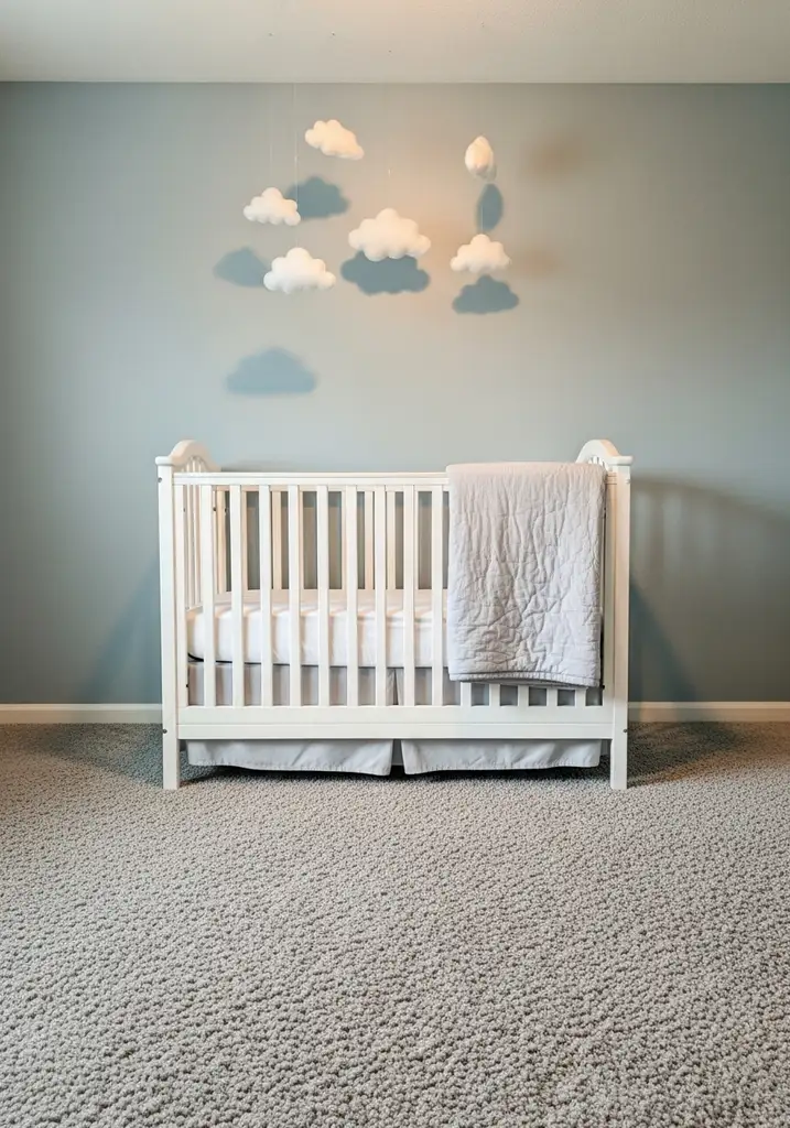
A dreamy nursery showcases walls painted in Misty, a white crib, and a plush gray rug, creating a serene atmosphere.
Misty is an exquisitely pale and ethereal blue-gray, so soft it almost reads as a cool white in certain lights, yet always retaining its delicate blue character. It is a whisper of a color that brings a sophisticated palette and a serene atmosphere without being overly dominant. This shade is perfect for creating a subtle backdrop.
This versatile shade is ideal for bedrooms, nurseries, or even ceilings to mimic a bright sky, creating a sense of height and openness. It pairs beautifully with other soft neutrals, pale woods, and metallic accents for a refined and elegant look. Its tranquil hue ensures a peaceful environment, making it a favorite for restful spaces.
11. Benjamin Moore Woodlawn Blue HC-147
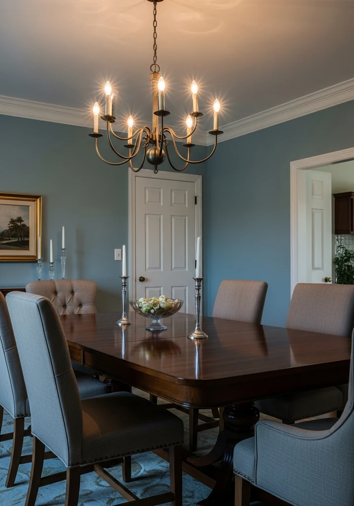
A traditional dining room features walls painted in Woodlawn Blue, a dark wood table, and upholstered chairs for classic elegance.
Woodlawn Blue, part of Benjamin Moore’s historical collection, is a classic light blue with noticeable green undertones, giving it a timeless and understated elegance. It offers a subtle depth and a refreshing feel that is both sophisticated and inviting. This color evokes a sense of tradition and calm, making it a truly versatile shade.
This tranquil hue is excellent for dining rooms, formal living spaces, or entryways, where its historic charm can truly shine. It pairs beautifully with dark wood furniture, antique pieces, and rich fabrics, enhancing a traditional or transitional design. Its sophisticated palette ensures a welcoming yet refined ambiance in any room.
12. Sherwin Williams Stardew SW 9138
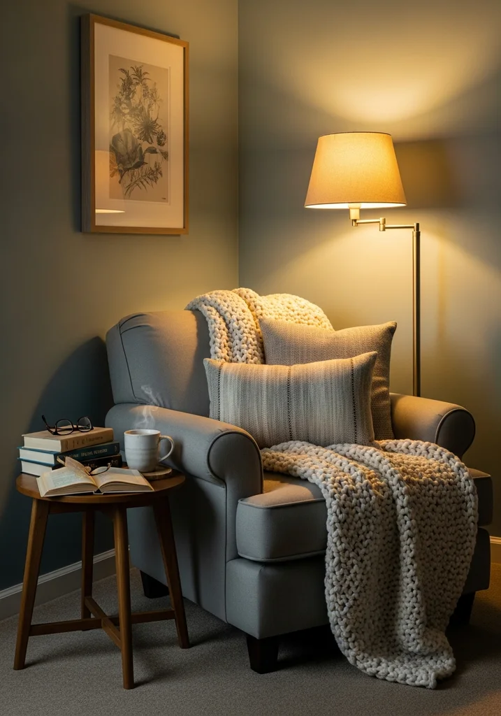
This cozy reading nook features walls painted in Stardew, a comfortable armchair, and a side table, creating a serene atmosphere.
Stardew is a beautiful, muted blue-gray with a slightly dusty quality, offering a sophisticated palette that feels both grounded and serene. It is a more complex shade than a pure light blue, providing depth and character without being overwhelming. This tranquil hue is perfect for creating a cozy yet elegant atmosphere.
This versatile shade is wonderfully suited for bedrooms, cozy reading nooks, or even an accent wall in a living room. It pairs well with warm wood tones, creamy whites, and soft grays, creating a harmonious and inviting space. Its subtle undertones allow it to adapt beautifully to different lighting conditions, always maintaining its calming effect.
13. Farrow & Ball Skylight 205
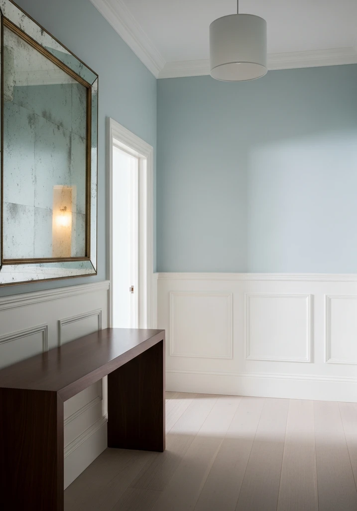
A light and airy hallway features walls painted in Skylight, white wainscoting, and a dark wood console table, enhancing natural light.
Skylight is a very pale, atmospheric blue with distinct gray undertones, designed to evoke the feeling of natural light pouring into a room. It is an incredibly subtle and sophisticated palette that brings a soft, airy quality to any space. This tranquil hue is perfect for creating an understated yet elegant backdrop.
This versatile shade works exceptionally well in rooms that may lack abundant natural light, making them feel brighter and more open. It pairs beautifully with Farrow & Ball’s traditional whites and off-whites, enhancing its delicate charm. Its refreshing feel is ideal for living rooms, hallways, and bedrooms, offering a consistently peaceful environment.
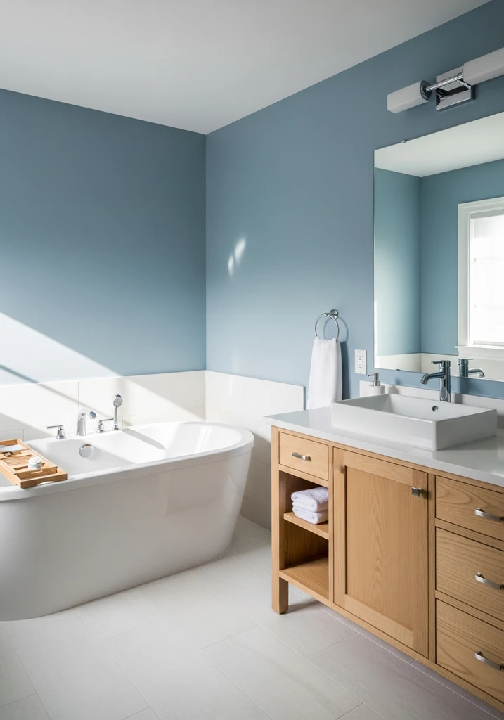
14. Behr Light French Gray PPU18-05
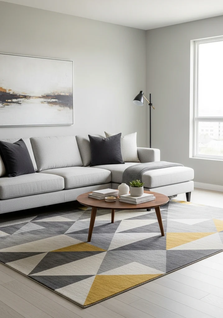
A modern living room showcases walls painted in Light French Gray, a light gray sectional sofa, and minimalist decor.
While named ‘Light French Gray,’ this popular Behr shade possesses distinct cool blue undertones that often make it read as a sophisticated blue-gray in many environments. It is a versatile shade that offers a clean, crisp look without feeling overly cold, providing a beautiful backdrop for various decor styles. This color provides a contemporary feel with a classic touch.
This sophisticated palette is excellent for open concept living areas, modern bedrooms, or even kitchen cabinets, offering a refreshing feel that is both current and timeless. It pairs wonderfully with bright whites, dark grays, and metallic accents for a chic, modern aesthetic. Its adaptability makes it a favorite for those seeking a neutral with a subtle hint of color.
15. Valspar Seafoam Green 5004-10A
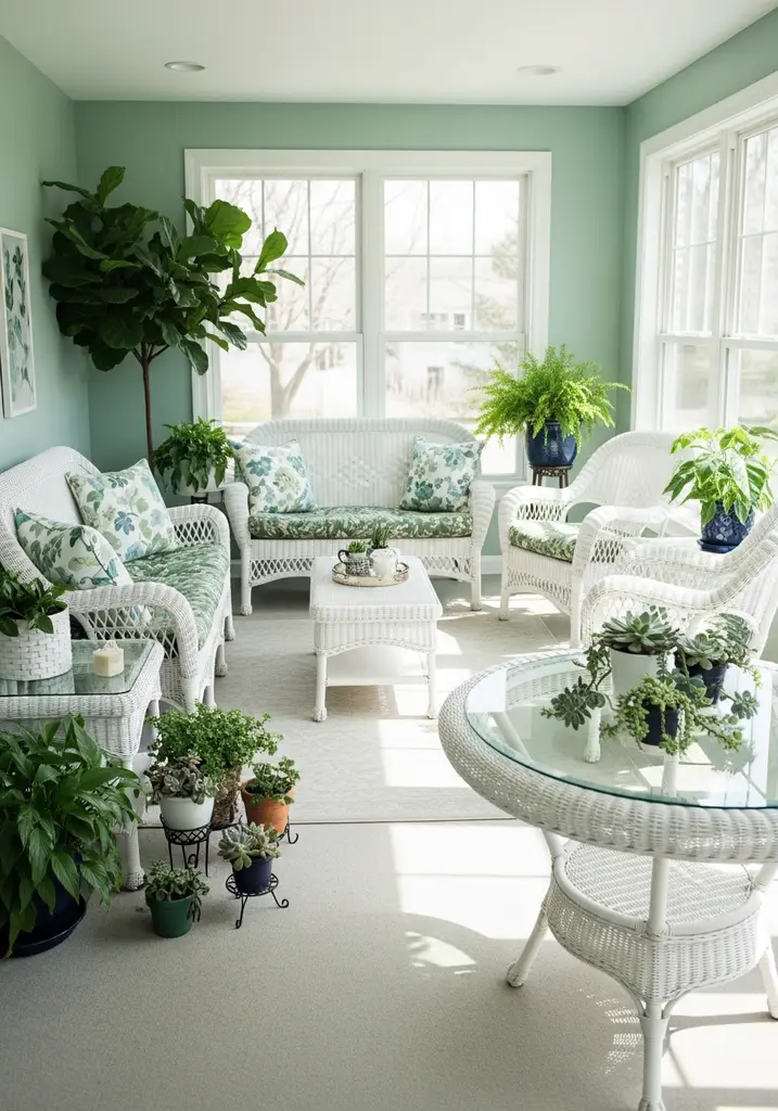
A bright sunroom features walls painted in Seafoam Green, white wicker furniture, and potted plants, creating a refreshing feel.
Despite its name, Valspar’s Seafoam Green is a very light, airy blue-green that strongly leans towards blue, capturing the essence of shallow ocean waters. It provides a refreshing feel that is both vibrant and calming, perfect for creating a lively yet tranquil hue. This color is an excellent choice for infusing a space with a subtle coastal vibe.
This versatile shade is wonderful for bathrooms, sunrooms, or children’s play areas, bringing a sense of joy and lightness. It pairs beautifully with crisp whites, sandy beiges, and natural textures to enhance its organic, seaside appeal. Its sophisticated palette makes it suitable for various homes, from beach houses to suburban residences seeking a touch of the ocean.
16. Benjamin Moore Clear Skies 2054-70
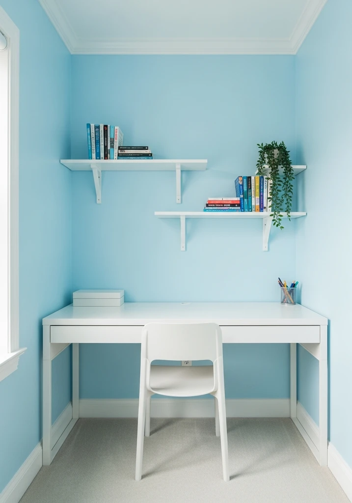
This small, bright home office features walls painted in Clear Skies, a white desk, and minimal shelving for an airy feel.
Clear Skies is an exceptionally pale, clean blue that is almost white, bringing an unparalleled sense of openness and purity to any room. It has very subtle undertones, ensuring it reads as a true, light blue without any unexpected shifts. This tranquil hue is perfect for creating an expansive and airy atmosphere.
This refreshing feel is ideal for small rooms, hallways, or ceilings, where it can make spaces feel larger and brighter. It pairs effortlessly with other cool pastels, bright whites, and natural light wood tones for a minimalist or Scandinavian-inspired design. Its sophisticated palette consistently delivers a serene and uncluttered aesthetic.
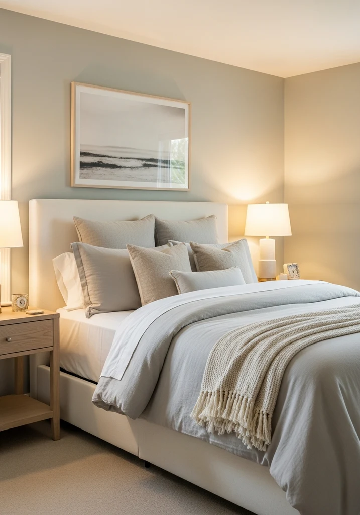
17. Sherwin Williams Sleepy Blue SW 6227
A calming bedroom features walls painted in Sleepy Blue, an upholstered headboard, and soft white and beige bedding for rest.
Sleepy Blue is a wonderfully calming and slightly muted light blue, specifically designed to promote relaxation and restful sleep. It possesses a gentle softness that prevents it from feeling stark, creating a warm and inviting sophisticated palette. This tranquil hue is a perfect choice for personal sanctuaries.
This versatile shade is, as its name suggests, exceptional for bedrooms and nurseries, fostering a peaceful and serene atmosphere. It pairs beautifully with creamy whites, soft grays, and warm wood tones to enhance its comforting appeal. Its refreshing feel contributes to a restful environment, making it a top pick for creating a tranquil retreat.
Design Comparison: What to Expect
| Style/Type | Key Features | Best For |
|---|---|---|
| Coastal Retreat | Breezy light blues and greens, natural textures, white trim, light wood accents | Sunny rooms, beach houses, creating a vacation like feel |
| Modern Minimalist | Clean, crisp light blues, simple forms, subtle textures, cool-toned metals | Contemporary homes, small spaces, achieving a serene and uncluttered look |
| Classic Elegance | Muted blue-grays, traditional furnishings, ornate details, warm metallic accents | Formal living areas, dining rooms, bedrooms seeking a sophisticated palette |
| Bohemian Chic | Soft, earthy blue-greens, layered textiles, eclectic decor, natural materials | Creative spaces, cozy bedrooms, combining global influences with a relaxed vibe |
| Scandinavian Inspired | Very pale, almost white blues, light wood, functional furniture, warm textiles | Bright, airy homes, minimalist aesthetics, creating a sense of calm and hygge |
How to Choose Your Perfect Light Blue Paint Color
Selecting the perfect light blue paint color begins with understanding the room’s natural light and its direction. North facing rooms receive cooler light, so a light blue with warm undertones or a slight green tint can prevent the space from feeling too cold. South facing rooms, conversely, benefit from pure or slightly grayed blues that can temper the intense warm light without appearing washed out.
Next, evaluate the undertones of the light blue samples you are considering, as they significantly impact the overall sophisticated palette. Blues can have green, gray, or even subtle purple undertones, which will interact with your existing furnishings, flooring, and fixed elements. Hold paint swatches against your sofa, rug, and curtains to see how they harmonize together.
Always test paint swatches on different walls in the actual space and observe them throughout the day under various lighting conditions, including natural light and artificial lighting. A color can look entirely different on a small chip than it does on a large wall, and its appearance will change from morning to evening. This step is crucial for making an informed decision about your tranquil hue.
Finally, consider the mood you wish to create and the room’s primary function. A soft, muted blue is excellent for a serene atmosphere in a bedroom, while a brighter, clearer blue might be perfect for a refreshing feel in a kitchen or bathroom. Thinking about the desired emotional response will guide you towards the most suitable light blue shade.
Common Mistakes to Avoid When Choosing Light Blue Paint
One common mistake is ignoring the undertones of light blue paint colors, which can lead to unexpected shifts in how the color appears on your walls. A blue that looks pure on a paint chip might reveal strong green or gray undertones once applied, clashing with other elements in your room. Always scrutinize the subtle hints of other colors within your chosen light blue.
Another frequent error is not testing paint swatches in the actual space, under varying natural and artificial lighting conditions. Relying solely on a small paint chip in a store or online image can be highly misleading, as colors appear differently depending on light sources and surrounding colors. Purchase sample pots and paint large swatches on several walls to observe their true behavior.
Overlooking how light blue interacts with existing fixed elements like flooring, cabinetry, and trim is another pitfall to avoid. A beautiful light blue might clash with warm toned wood floors or cream colored trim if its undertones are too cool or vibrant. Ensure your chosen sophisticated palette complements these permanent features, creating a cohesive design.
Finally, choosing a light blue solely based on its popularity or a trend without considering your personal preferences and the room’s specific needs is a mistake. While a particular color may be widely loved, it might not be the right tranquil hue for your home or the atmosphere you wish to create. Trust your instincts and focus on what brings you joy and comfort in your own space.
Frequently Asked Questions
What rooms are best suited for light blue paint colors?
Light blue paint colors are incredibly versatile and can enhance many rooms, especially bedrooms, bathrooms, and living rooms, where a serene atmosphere is desired. Their calming effect makes them ideal for creating peaceful retreats, while brighter shades can bring a refreshing feel to kitchens and laundry rooms. They also work wonderfully in nurseries, fostering a tranquil and gentle environment.
What colors pair well with light blue paint?
Light blue paint pairs beautifully with a wide range of complementary colors, depending on the desired sophisticated palette. Crisp whites and creamy off-whites create a classic, airy look, while natural wood tones and sandy beiges enhance a coastal vibe. For bolder contrast, consider deep navy, coral, or even soft yellows, which can add visual interest without overwhelming the tranquil hue.
Can light blue paint make a room feel cold?
While some light blues, particularly those with strong gray or cool undertones, can make a room feel cooler, many shades offer a refreshing feel without being cold. To avoid a chilly ambiance, choose light blues with subtle green or warm gray undertones, or pair them with warm lighting, wood furniture, and cozy textiles. The right balance of elements ensures a serene atmosphere that is also inviting.
How does lighting affect light blue paint colors?
Lighting significantly impacts how light blue paint colors appear, causing them to shift throughout the day. Natural light from different directions (north, south, east, west) will highlight various undertones, making a color appear more green, gray, or purely blue. Artificial lighting, whether warm or cool, will also alter the perception of the sophisticated palette, making it crucial to test swatches in your specific space.
Is light blue paint a timeless choice for home interiors?
Yes, light blue paint is widely considered a timeless and classic choice for home interiors, transcending fleeting trends. Its inherent connection to nature, like the sky and ocean, gives it enduring appeal and a consistently refreshing feel. While specific shades may gain popularity, the overall category of light blue remains a perennial favorite for creating a serene atmosphere and a sophisticated palette that stands the test of time.
Conclusion
Light blue paint colors offer an unparalleled ability to infuse homes with a sense of calm, freshness, and sophisticated beauty. From the subtle whispers of blue-gray to the invigorating clarity of sky blue, each shade presents a unique opportunity to craft a tranquil hue tailored to your personal style. By understanding undertones, testing swatches, and considering your room’s specific needs, you can confidently select a light blue that transforms your space into a serene retreat. Embrace the versatility and timeless appeal of these exquisite colors to create an atmosphere you will cherish for years to come.


