
Discover Your Perfect Shade: Top 17 Light Tan Paint Colors for a Cozy Home

Overview
This article explores the top 17 light tan paint colors, offering a curated selection for homeowners and designers alike. Perfect for anyone seeking warmth, versatility, and timeless elegance in their living spaces, you will discover popular shades, their unique undertones, and expert tips for successful application. Get insights to transform your home with confidence, ensuring a beautiful and inviting atmosphere.
Key Takeaways
- Light tan paint offers incredible versatility, suitable for nearly any room and design style.
- Understanding undertones like pink, green, or gray is crucial for selecting the right tan.
- Always sample paint colors on your walls to see how they react to your home’s unique lighting.
- Light tan shades create a warm and inviting backdrop that pairs well with many textures and materials.
- Choosing the right light tan can enhance perceived space and complement both modern and traditional decor.
Light tan paint colors offer an unparalleled blend of warmth, versatility, and timeless elegance, making them a perennial favorite for interior design. These sophisticated neutrals provide a soft backdrop that can instantly make a room feel more inviting and cohesive, adapting beautifully to various decorating styles. From designing hundreds of spaces, it is clear that light tan hues serve as a foundational element for creating serene and stylish interiors.
In this comprehensive guide, you will discover 17 exceptional light tan paint colors, each with its own distinct character and charm. We will delve into their unique qualities, discuss ideal applications, and provide expert tips to help you select the perfect shade to transform your home into a sanctuary of comfort and style. Design experts at Sherwin Williams often highlight the importance of considering a color’s undertones, a principle we explore in detail for each selection.
1. Sherwin Williams Accessible Beige

This open concept living room showcases Sherwin Williams Accessible Beige walls, complemented by a light gray sofa and natural wood furniture.
Accessible Beige is a true chameleon, balancing warmth with a subtle gray undertone that prevents it from feeling too yellow or orange. This highly popular shade provides a soft, welcoming feel that works beautifully in almost any room, reflecting light gently to brighten spaces. It features a harmonious blend of beige and gray, making it a versatile neutral that complements a wide array of furnishings.
This color is ideal for open concept living areas where a consistent, flowing aesthetic is desired, as it transitions effortlessly between different lighting conditions. According to experts at Benjamin Moore, testing samples on multiple walls is essential to observe how a color truly appears throughout the day, a practice particularly useful for a nuanced shade like Accessible Beige.
2. Benjamin Moore Manchester Tan

A traditional dining room features Benjamin Moore Manchester Tan walls, a dark wood dining table, and elegant upholstered chairs.
Manchester Tan is a warm, inviting light tan with a creamy, golden undertone that creates a cozy and traditional atmosphere. It has a classic appeal that feels both sophisticated and approachable, making it a favorite for many homeowners. This shade provides a comforting warmth without overpowering a room, and it looks particularly rich in spaces with ample natural light.
This color is perfectly suited for bedrooms, dining rooms, and studies where a sense of intimacy and elegance is desired. Its golden notes pair beautifully with antique wood furniture and classic decor, offering a timeless backdrop. Consider using white trim to make the creamy tan pop and define the architectural details of your space.
3. Sherwin Williams Kilim Beige

This cozy family room features Sherwin Williams Kilim Beige walls, complemented by a cream sectional sofa and colorful throw pillows.
Kilim Beige is a warm and gentle light tan with discernable peachy undertones that give it a unique, sun-kissed glow. This color is incredibly inviting and can make a room feel instantly brighter and more cheerful, especially in north facing rooms that receive cooler light. It provides a soft, earthy warmth that is both welcoming and comforting.
This shade excels in family rooms, nurseries, and entryways where a friendly and open ambiance is desired. Its peachy warmth harmonizes well with terracotta accents, woven textures, and light colored wood tones, creating a relaxed and natural aesthetic. Ensure you test this color thoroughly, as its undertones can become more prominent in different lighting conditions.
4. Benjamin Moore Shaker Beige

An elegant bedroom showcases Benjamin Moore Shaker Beige walls, a wooden sleigh bed, and soft white bedding.
Shaker Beige is a slightly deeper, more saturated light tan with warm, earthy undertones that evoke a sense of grounded tranquility. It offers a sophisticated depth that lighter tans might lack, providing a comforting and stable presence in a room. This color is rich without being overwhelming, offering a beautiful balance for various design styles.
This paint color is an excellent choice for bedrooms, studies, or living rooms where a calm and refined atmosphere is paramount. It pairs beautifully with both dark and light wood furniture, and its earthy quality makes it a great match for natural stone and linen fabrics. Consider using it in a space with good natural light to truly appreciate its subtle warmth and depth.
5. Sherwin Williams Natural Tan

A bright kitchen features Sherwin Williams Natural Tan walls, white shaker cabinets, and butcher block countertops.
Natural Tan is a true, unadulterated light tan that avoids strong yellow, pink, or green undertones, offering a pure and clean neutral. It provides a straightforward warmth that feels authentic and organic, making it incredibly easy to work with in diverse design schemes. This shade is one of the most balanced light tans available, delivering a consistent look across different lighting situations.
This color is highly versatile and performs exceptionally well in almost any space, from kitchens to bathrooms to hallways. It serves as a perfect canvas for layering different textures and colors, allowing your furnishings and art to truly shine. For a harmonious look, pair it with off white trim and natural materials like jute, rattan, and unfinished wood.
6. Sherwin Williams Canvas Tan

This minimalist living room displays Sherwin Williams Canvas Tan walls, a sleek sofa, and abstract artwork.
Canvas Tan is a soft, airy light tan with subtle cream and very light gray undertones, giving it a sophisticated and understated elegance. It is lighter than many traditional tans, offering a fresh take on a classic neutral that brightens rooms without feeling stark. This shade provides a gentle warmth that is both inviting and refined, making it a popular choice for contemporary homes.
This color is excellent for creating a serene and expansive feel in living rooms, master bedrooms, and even home offices. Its subtle nuances allow it to pair beautifully with both warm and cool palettes, offering great flexibility in decor choices. From personal observation, it looks particularly stunning with crisp white trim and minimalist furnishings, enhancing its clean aesthetic.
7. Benjamin Moore Grant Beige

A serene home office features Benjamin Moore Grant Beige walls, a dark wood desk, and built in bookshelves.
Grant Beige is a rich, earthy light tan that carries a distinctive green undertone, giving it a sophisticated and organic feel. This complex neutral offers more depth than a typical beige, leaning into a muted, natural aesthetic that is both calming and intriguing. Its slight green cast prevents it from appearing too yellow or orange, making it a balanced choice.
This color is wonderful for creating a grounded and serene atmosphere in spaces like a study, den, or a master bathroom. It pairs exceptionally well with dark wood, deep greens, and other natural tones, creating a harmonious and sophisticated palette. Design professionals often recommend pairing it with warm white trim to highlight its nuanced character.
8. Sherwin Williams Urban Putty

This contemporary living room showcases Sherwin Williams Urban Putty walls, a charcoal gray sofa, and metallic accent tables.
Urban Putty is a warm greige that often reads as a light tan, featuring prominent gray undertones softened by a gentle warmth. This versatile color bridges the gap between gray and beige, offering a sophisticated neutral that adapts well to various lighting conditions. It provides a contemporary feel while retaining a comforting warmth, making it a highly adaptable choice.
This shade is ideal for modern transitional spaces, open concept homes, and areas where you want a sophisticated neutral that isn’t too stark or too yellow. It pairs beautifully with modern furniture, metallic accents, and textured fabrics, creating a chic and inviting environment. Consider using it in a living room or bedroom for a refined yet cozy feel.
9. Benjamin Moore Edgecomb Gray

A bright bedroom features Benjamin Moore Edgecomb Gray walls, a linen upholstered headboard, and white bedding.
Edgecomb Gray is a highly popular greige that frequently presents as a warm light tan, especially in rooms with ample natural light or warm artificial lighting. It possesses a beautiful balance of gray and beige, offering a soft, muted warmth that is incredibly versatile and soothing. This color has a unique ability to adapt, sometimes appearing more gray and other times more tan, depending on the environment.
This shade is an excellent choice for almost any room, from kitchens to bathrooms to bedrooms, providing a sophisticated and calming backdrop. It pairs wonderfully with both cool and warm decor elements, making it a go to for creating cohesive designs. From personal experience, it works especially well with white trim and natural textures, enhancing its understated elegance.
10. Sherwin Williams Macadamia

This luxurious living room displays Sherwin Williams Macadamia walls, a plush velvet sofa, and gold accent decor.
Macadamia is a richer, more golden light tan that exudes warmth and a luxurious feel without being overly dark. It has a beautiful depth and a slight caramel undertone that makes a room feel instantly cozy and inviting. This color is less subtle than some other light tans, offering a more pronounced and comforting presence.
This shade is perfect for creating a warm and opulent atmosphere in living rooms, dens, or master suites. It pairs exceptionally well with dark wood furniture, gilded accents, and rich fabrics like velvet or silk, enhancing its sophisticated appeal. For a cohesive look, consider painting accent pieces in a slightly darker tan or a complementary deep brown.
11. Benjamin Moore Muslin

A serene nursery features Benjamin Moore Muslin walls, a white crib, and light wood furniture.
Muslin is a classic, soft, and warm off white that leans into a very light tan with subtle cream undertones, creating a gentle and inviting ambiance. It is a wonderfully understated color that brightens a space while imparting a sense of quiet sophistication. This shade is one of those timeless neutrals that never goes out of style, offering versatility and elegance.
This color is ideal for creating a soft, airy feel in bedrooms, nurseries, or any space where a light and soothing palette is desired. It pairs beautifully with natural wood tones, crisp white linens, and pastel accents, fostering a calm and harmonious environment. Its subtle warmth makes it a great alternative to stark white, adding character without overwhelming the room.
12. Sherwin Williams Neutral Ground

A spacious hallway showcases Sherwin Williams Neutral Ground walls, a console table, and hardwood floors.
Neutral Ground is a very light, warm, and creamy tan that offers a gentle touch of color without being overtly beige or yellow. It provides a soft, luminous quality that helps to brighten spaces while maintaining an inviting warmth. This shade is perfect for those who want a neutral that feels subtly colored rather than stark white, offering a serene backdrop.
This color is highly effective in creating an expansive and welcoming atmosphere in hallways, open concept living areas, and kitchens. It works harmoniously with both modern and traditional decor, serving as a versatile foundation for various design elements. Pair it with slightly darker tan accents or warm wood tones to enhance its inherent creaminess.
13. Benjamin Moore Monroe Bisque

A sunlit living room features Benjamin Moore Monroe Bisque walls, a comfortable sofa, and patterned armchairs.
Monroe Bisque is a warm, inviting light tan with noticeable golden and peach undertones that give it a rich, sun drenched quality. This color is vibrant and cheerful without being overpowering, making a room feel instantly brighter and more alive. It offers a comforting warmth that is both traditional and appealing, creating a cozy atmosphere.
This shade is well suited for living rooms, sunrooms, and kitchens where a bright and cheerful ambiance is desired. Its golden notes pair beautifully with traditional wood furniture, floral patterns, and warm metallic accents, enhancing its classic charm. Experts suggest sampling this color in different lighting to ensure its golden hues complement your existing decor.
14. Sherwin Williams Ancient Marble
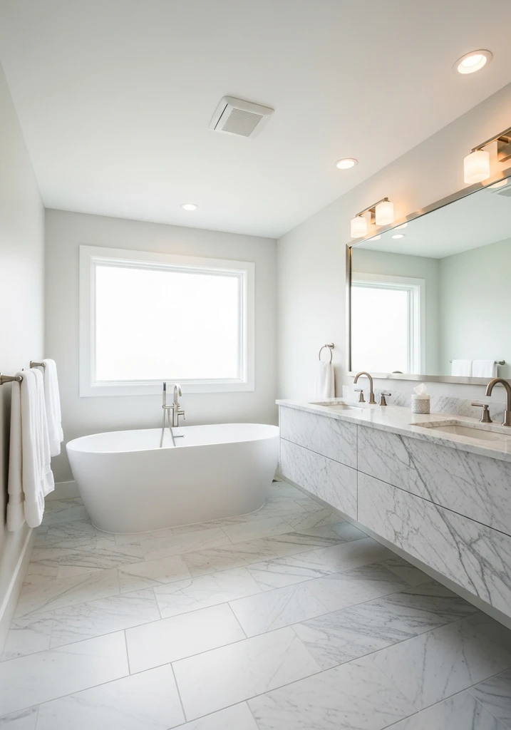
A sophisticated master bathroom showcases Sherwin Williams Ancient Marble walls, a freestanding tub, and a marble vanity.
Ancient Marble is a sophisticated light tan that carries subtle gray and very slight green undertones, giving it a muted, earthy elegance. It is a wonderfully balanced color that feels both warm and grounded, providing a calm and refined backdrop for any space. This shade offers a nuanced complexity that sets it apart from more straightforward tans.
This color is ideal for creating a tranquil and thoughtful atmosphere in studies, master bathrooms, or formal living rooms. It pairs beautifully with natural stone, dark wood, and textured fabrics, enhancing its organic appeal. For a cohesive design, consider using it with a warm white trim to highlight its gentle complexity and create a crisp contrast.
15. Benjamin Moore Smokey Taupe

This chic living room displays Benjamin Moore Smokey Taupe walls, a cream sofa, and dark wood shelving.
Smokey Taupe is a deeper, more sophisticated light tan that leans heavily into gray, creating a rich and complex greige. This color offers a grounded elegance, providing a beautiful balance between warmth and coolness that makes it incredibly versatile. It has a distinctive depth that can add character and a refined touch to any room.
This shade is perfect for creating a cozy yet chic atmosphere in living rooms, dining areas, or bedrooms. It pairs exceptionally well with both dark and light wood tones, metallic accents, and a range of fabric textures, from linen to velvet. Its adaptable nature allows it to work with a variety of decor styles, from modern to traditional.
16. Sherwin Williams Palace White

A bright and airy bedroom features Sherwin Williams Palace White walls, a simple bed, and white bedding.
Palace White is an extremely light, almost off white, with delicate warm tan and creamy undertones that prevent it from feeling stark. It offers a soft, ethereal quality that brightens a space while imparting a subtle hint of color and warmth. This shade is a wonderful choice for those who desire a very light, almost invisible tan that provides warmth without strong saturation.
This color is ideal for creating an open, airy, and expansive feel in any room, particularly effective in smaller spaces or those with limited natural light. It pairs beautifully with crisp white trim, light wood furniture, and minimalist decor, enhancing its clean and fresh aesthetic. From observation, it serves as an excellent foundational color for layering various textures and subtle patterns.
17. Benjamin Moore White Sand

A calm living room displays Benjamin Moore White Sand walls, a cream sofa, and a natural fiber rug.
White Sand is a very light, sophisticated tan with subtle greige undertones, giving it a refined and tranquil character. It is a wonderfully balanced neutral that offers a gentle warmth without leaning too yellow or pink, creating a serene and understated backdrop. This shade is perfect for achieving a soft, muted look that works well in a variety of settings.
This color is an excellent choice for bedrooms, bathrooms, and living areas where a calm and spa like atmosphere is desired. It pairs beautifully with natural textures, white and off white fabrics, and light wood tones, enhancing its serene quality. Consider using it in conjunction with other subtle neutrals for a monochromatic scheme that feels both rich and relaxing.
Design Comparison: What to Expect
| Style/Type | Key Features | Best For |
|---|---|---|
| Modern Farmhouse | Warm light tans with subtle gray, natural wood, distressed finishes, comfortable textiles. | Creating cozy, inviting spaces with a rustic yet refined feel. |
| Coastal Chic | Light, airy tans with sandy undertones, white trim, natural light, woven textures, blue accents. | Achieving a bright, relaxed, and breezy atmosphere reminiscent of the beach. |
| Traditional Elegance | Creamy or golden light tans, rich wood furniture, classic patterns, ornate details, sophisticated fabrics. | Developing a timeless, refined, and formal yet comfortable interior. |
| Minimalist Warmth | Pure, muted light tans with minimal undertones, clean lines, simple forms, layered textures, functional design. | Designing serene, uncluttered spaces that feel inviting and calm. |
| Bohemian Retreat | Earthier light tans with green or yellow undertones, layered textiles, global inspired patterns, natural materials, eclectic decor. | Crafting a relaxed, artistic, and well traveled ambiance. |
How to Choose Your Perfect Light Tan Paint Color
Choosing the ideal light tan paint color involves understanding your home’s unique characteristics and your personal aesthetic preferences. Begin by considering the amount and direction of natural light your room receives, as this significantly impacts how a color appears throughout the day. North facing rooms often benefit from warmer tans to counteract cooler light, while south facing rooms can handle cooler tans.
Next, pay close attention to the undertones present in different light tan shades, which can range from pink and peach to green and gray. These subtle hues will influence the overall feeling of your room and how the paint color harmonizes with your existing furniture, flooring, and fixed elements. Take samples home and paint large swatches on multiple walls to observe these nuances in real time.
Always consider your existing furnishings and architectural details when making your selection. A light tan should complement, not compete with, your furniture, artwork, and trim colors. Think about the mood you want to create; a creamy tan might feel cozy, while a greige tan could be more sophisticated, guiding your choice.
Finally, don’t rush the decision and make sure to view your samples in both natural daylight and artificial evening light. The appearance of a color can change dramatically from morning to night, so thorough testing is key to ensuring long term satisfaction with your chosen light tan. This careful approach helps avoid surprises once the entire room is painted.
Common Mistakes to Avoid When Choosing Light Tan Paint
One of the most common mistakes when selecting light tan paint is neglecting to test samples directly on your walls. Relying solely on small paint chips can be misleading, as colors appear different in various lighting conditions and against existing decor. Always purchase sample pots and paint large squares on at least two walls to truly see how the color interacts with your space.
Another frequent error is ignoring the subtle undertones of a light tan, which can lead to unexpected results once the paint is applied. A tan with a hidden pink undertone might clash with green furnishings, for example. Pay close attention to how a color shifts in different lights and against your existing decor to ensure harmony.
Many homeowners also make the mistake of choosing a light tan without considering the room’s fixed elements, such as flooring, cabinetry, or stone fireplaces. These permanent features have their own undertones that must be taken into account to avoid clashes. Your paint color should complement, rather than fight against, these established elements.
Lastly, failing to consider the overall flow and continuity of your home can result in disjointed spaces. While each room can have its own personality, choosing light tan shades that relate to each other or a common neutral palette creates a more cohesive and professional look throughout your entire home. Plan your color scheme holistically for the best results.
Frequently Asked Questions
What are the best light tan paint colors for small spaces?
For small spaces, consider very light tans with subtle undertones, such as Sherwin Williams Palace White or Benjamin Moore Muslin. These shades offer warmth without overwhelming the room, helping it feel more open and airy. Their gentle luminosity reflects light, which can make a small area appear larger and more inviting.
How do I identify undertones in tan paint?
To identify undertones, place your paint sample against a pure white background, like a piece of printer paper, and compare it to other colors. This contrast will often reveal subtle hints of pink, green, yellow, or gray that might otherwise be missed. Also, observe the color in different lighting conditions throughout the day, as undertones can become more apparent.
Can light tan paint work with cool decor?
Absolutely, light tan paint can beautifully complement cool decor, especially shades with gray or green undertones like Benjamin Moore Edgecomb Gray or Sherwin Williams Ancient Marble. These balanced tans bridge the gap between warm and cool, creating a sophisticated and harmonious contrast. They provide a grounding warmth that prevents cool tones from feeling too stark.
What trim colors pair well with light tan?
Crisp white trim is a classic and highly effective choice that provides a clean contrast and makes light tan walls pop. Warm off whites or creamy whites also work wonderfully, creating a softer, more cohesive look. Avoid stark, cool whites if your tan has strong warm undertones, as this can create an unintended clash.
Is light tan paint going out of style?
Light tan paint is a timeless classic that consistently remains in style due to its versatility and inherent warmth. While specific shades may trend, the fundamental appeal of light tan as a sophisticated neutral ensures its enduring popularity. It provides a comforting and adaptable backdrop that transcends fleeting design fads, making it a reliable choice for any home.
Conclusion
The world of light tan paint colors offers an incredible spectrum of warmth, sophistication, and versatility, proving that neutrals are anything but boring. From subtle greiges to creamy golden hues, each shade provides a unique opportunity to transform your home into a haven of comfort and style. By understanding undertones, testing samples diligently, and considering your home’s unique light, you can confidently select the perfect light tan to create an inviting and cohesive space. Embrace the timeless elegance of these beautiful colors and watch your interiors come alive with understated charm and warmth.


