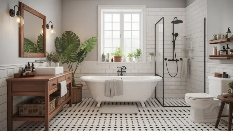
Top 19 Very Pale Blue Shades and How to Use Them in Your Home

Overview
This article explores the top 19 very pale blue shades, offering inspiration and practical guidance for incorporating these calming hues into your home decor. Perfect for homeowners, designers, and anyone seeking to create serene and stylish spaces, you will discover the unique characteristics of each shade and learn how to apply them effectively. Get expert insights to transform your living environment with confidence and elegance.
Key Takeaways
- Very pale blue shades offer versatility, from calming bedrooms to fresh kitchens.
- Understanding undertones like gray, green, or violet is key to selecting the right pale blue.
- Pair pale blue with natural textures and neutral colors for a balanced, sophisticated look.
- Lighting significantly impacts how pale blue appears, so test samples in your actual space.
- These hues can make rooms feel larger and brighter, enhancing natural light.
Very pale blue hues offer an unparalleled sense of calm and sophistication, transforming any room into a tranquil retreat. These subtle shades, ranging from almost white with a hint of color to soft, muted tones, possess a unique ability to evoke feelings of peace and spaciousness. From designing hundreds of spaces, I have observed that the right pale blue can dramatically enhance natural light and create an airy atmosphere.
This comprehensive guide will unveil 19 distinct very pale blue expressions, detailing their visual characteristics and ideal applications. You will discover expert insights on how to pair these colors with various textures and materials, ensuring a harmonious and inviting aesthetic in your home. Prepare to explore the delicate beauty and transformative power of these exquisite blue tones.
1. Sky Mist: The Ethereal Whisper

This minimalist bedroom features walls painted in Sky Mist, a very light pale blue, complemented by crisp white linen bedding.
Sky Mist is a truly ethereal pale blue, so light it almost merges with white, offering just a whisper of color. This shade captures the essence of a clear morning sky, providing a soft and airy backdrop for any design. It has a delicate quality that makes it feel expansive and incredibly soothing.
This hue works beautifully in bedrooms and bathrooms, fostering a deeply relaxing environment. Design experts at Architectural Digest often highlight how such light colors can make smaller spaces feel significantly larger and more open. Pair it with natural wood tones and crisp white linens for an inviting, serene escape.
2. Morning Frost: Crisp and Refreshing

A modern kitchen showcases cabinets painted in Morning Frost, a crisp pale blue, paired with white quartz countertops.
Morning Frost is a crisp, cool pale blue with subtle gray undertones, reminiscent of a frosty winter morning. This shade brings a refreshing and clean aesthetic to any room, reflecting light beautifully. It offers a sophisticated coolness without being overly stark or cold.
This invigorating blue is perfect for kitchens or home offices where clarity and focus are desired. It pairs exceptionally well with polished chrome fixtures and light gray cabinetry, creating a contemporary and highly functional space. Consider it for a clean, modern look that remains inviting.
3. Coastal Haze: Muted Ocean Serenity

This coastal living room features walls in Coastal Haze, a muted pale blue, accented by a linen sofa and wicker armchairs.
Coastal Haze is a muted, slightly greenish pale blue that evokes the tranquil, distant view of the ocean on a hazy day. This sophisticated shade offers a calming presence, blending seamlessly with natural elements. Its subtle green undertone adds a layer of organic warmth to the cool blue.
Ideal for living rooms or sunrooms, this color promotes relaxation and connection to nature. Combine it with woven textures, weathered wood, and sandy beige accents to complete a breezy, coastal inspired decor. It is a versatile choice for creating a relaxed yet elegant atmosphere.
4. Whisper Blue: The Barely There Hue

A bright hallway features walls painted in Whisper Blue, a barely there pale blue, with crisp white trim and a large mirror.
Whisper Blue is an incredibly light, almost translucent pale blue, so subtle it is barely perceptible, yet impactful. It provides a soft wash of color that brightens and expands a space without drawing too much attention. This shade is perfect for those who want a hint of color but prefer a predominantly neutral palette.
This delicate hue excels in hallways or small powder rooms, where it can make the area feel more open and inviting. Pair it with bright white trim and reflective surfaces like mirrors to maximize its airy effect. It is an excellent choice for achieving a refined, understated elegance.
5. Arctic Light: Clean and Pure

This modern bathroom showcases walls in Arctic Light pale blue, complemented by white subway tiles and a sleek floating vanity.
Arctic Light is a bright, clean, and very cool pale blue, reminiscent of ice formations under a clear sky. This shade is intensely pure, bringing a sense of pristine freshness to any interior. It has a vividness that is striking yet still incredibly gentle.
This invigorating blue is wonderfully suited for bathrooms or laundry rooms, where cleanliness and brightness are paramount. It complements white subway tiles, brushed nickel fixtures, and clear glass accents beautifully, creating a spa like atmosphere. From personal observation, this color performs exceptionally well in spaces with ample natural light.
6. Cloud Drift: Gentle and Soft

A cozy nursery features walls painted in Cloud Drift, a soft pale blue, with a white crib and a plush rocking chair.
Cloud Drift is a soft, gentle pale blue with a subtle warmth, evoking the serene movement of clouds across a summer sky. This shade offers a comforting and approachable feel, making it incredibly versatile. It is a harmonious color that feels both fresh and inviting.
This welcoming hue is perfect for nurseries or guest bedrooms, creating a tender and soothing environment. Pair it with creamy whites, soft grays, and plush textiles to enhance its gentle character. It provides a delicate backdrop for a cozy and restful space.
7. Serene Aqua: Light and Calming

This spa-inspired bathroom showcases walls in Serene Aqua pale blue, complemented by natural stone tiles and a soaking tub.
Serene Aqua is a light, calming pale blue with a distinct hint of green, creating a refreshing and tranquil effect. This shade is reminiscent of shallow, clear waters, bringing a natural and restorative energy into a room. It balances the coolness of blue with the vitality of green.
This restorative color is ideal for spa inspired bathrooms or quiet reading nooks, promoting relaxation and well being. It pairs beautifully with natural stone, bamboo accents, and lush greenery, enhancing its organic appeal. Consider this shade for spaces where you seek to unwind and rejuvenate.
8. Powder Blue: The Classic Gentle Hue

A traditional living room features walls in classic Powder Blue, accented by a cream sofa and antique white wooden furniture.
Powder Blue is a classic, universally appealing pale blue known for its gentle and comforting presence. This shade has a timeless quality, often associated with innocence and softness. It is a straightforward, clean blue that avoids any strong undertones.
This beloved hue is excellent for children’s rooms, traditional living spaces, or even as a cheerful accent in a dining area. It pairs wonderfully with antique white furniture, floral patterns, and soft cotton fabrics, creating a charming and inviting atmosphere. According to Houzz, classic pale blues like Powder Blue consistently rank high for their ability to create a welcoming feel.
9. Glacier Tint: Icy Elegance

This minimalist dining room showcases walls in Glacier Tint pale blue, complemented by a glass dining table and chrome chairs.
Glacier Tint is an icy, very light blue with a subtle silver undertone, exuding an air of cool elegance. This shade feels exceptionally clean and modern, reflecting light with a subtle shimmer. It is a sophisticated choice for contemporary interiors.
This elegant blue is ideal for minimalist spaces, home offices, or even a chic dining room. It pairs beautifully with brushed steel, glass, and stark white elements, creating a sleek and uncluttered aesthetic. Consider this color for a refined and polished look that feels both fresh and sophisticated.
10. Horizon Blue: Expansive and Open

An open concept living room features walls painted in Horizon Blue, an expansive pale blue, with a large beige sectional sofa.
Horizon Blue is a pale, expansive blue that evokes the vastness of an open sky meeting the distant land. This shade offers an incredible sense of depth and openness, making any room feel larger and boundless. It is a pure, clear blue without prominent undertones.
This expansive hue is perfect for open concept living areas or large family rooms, promoting a feeling of freedom and tranquility. Pair it with light wood flooring, comfortable upholstered furniture in neutral tones, and minimal decor to enhance its spacious effect. It truly broadens the visual horizon of a room.
11. Seafoam Kiss: Breezy and Light

This bright sunroom showcases walls in Seafoam Kiss pale blue, an accent of white shiplap, and comfortable wicker furniture.
Seafoam Kiss is a light, airy pale blue with a delicate green tinge, reminiscent of the frothy edge of a gentle wave. This shade brings a breezy and refreshing feel to any space, perfect for creating a relaxed atmosphere. Its subtle green adds a touch of natural softness.
This refreshing hue is excellent for bathrooms, sunrooms, or even a light and airy kitchen. It pairs beautifully with white shiplap, natural jute rugs, and potted plants, enhancing its coastal or cottage inspired charm. Consider this color for a bright and welcoming space that feels effortlessly chic.
12. Pale Periwinkle: Soft and Romantic

A romantic bedroom features walls painted in Pale Periwinkle, a soft pale blue with violet, and an antique white iron bed.
Pale Periwinkle is a soft, very light blue with a subtle violet hint, creating a romantic and dreamy ambiance. This delicate shade offers a unique blend of cool and warm, making it both calming and inviting. Its hint of purple adds a touch of unexpected sophistication.
This romantic hue is wonderful for bedrooms, dressing rooms, or even a cozy reading nook. It pairs exquisitely with antique white furniture, floral textiles, and soft gold accents, creating an elegant and feminine retreat. From my experience, this color is particularly effective in spaces designed for personal indulgence.
13. Winter Sky: Deeply Pale and Clear

A sophisticated living room showcases walls in Winter Sky pale blue, complemented by a dark wood bookcase and gray velvet sofa.
Winter Sky is a deeply pale, cool, and clear blue, reminiscent of a crisp, cloudless winter day. This shade offers a sense of profound stillness and clarity, bringing a refreshing yet grounded feeling to a space. It is a clean blue that feels both strong and delicate.
This clear hue is excellent for living rooms, studies, or dining rooms where a sophisticated and calm atmosphere is desired. It pairs beautifully with dark wood furniture, metallic accents, and rich textures like velvet or wool. Consider this color for a refined interior that feels both elegant and serene.
14. Celeste Glow: Luminous and Delicate

This bright nursery features walls painted in Celeste Glow, a luminous pale blue, with a modern white crib and sheer curtains.
Celeste Glow is a luminous, very light, almost ethereal blue that seems to radiate a gentle inner light. This shade is incredibly delicate and uplifting, bringing a subtle brightness to any room. It has a slightly pearlescent quality that makes it feel precious.
This radiant hue is perfect for nurseries, creative studios, or spaces where you want to evoke a sense of wonder and gentle inspiration. Pair it with sheer white curtains, light wood furniture, and soft, understated art pieces. It creates an environment that feels both airy and subtly magical.
15. Arctic Stream: Clear and Flowing

A modern bathroom showcases walls in Arctic Stream pale blue, complemented by white ceramic tiles and a contemporary vanity.
Arctic Stream is a clear, flowing, slightly deeper pale blue that captures the essence of fresh, moving water. This shade feels invigorating and pure, bringing a sense of vitality and cleanliness to a space. It is a refreshing blue that is still undeniably light.
This invigorating hue is wonderfully suited for bathrooms, utility rooms, or even a vibrant kitchen island. It pairs excellently with white cabinetry, glass tiles, and polished chrome fixtures, creating a crisp and functional aesthetic. From my personal observation, this color is a fantastic choice for areas that need to feel clean and energetic.
16. Forget-Me-Not Haze: Delicate and Romantic

This cottage style bedroom features walls in Forget-Me-Not Haze pale blue, with a white wooden bed and floral patterned bedding.
Forget-Me-Not Haze is a delicate, slightly dusty, romantic pale blue with a subtle hint of lavender. This shade evokes the charm of a wildflower field, offering a soft and nostalgic ambiance. Its subdued quality makes it exceptionally comforting.
This romantic hue is ideal for cottage style bedrooms, cozy reading nooks, or a charming guest room. It pairs beautifully with vintage inspired furniture, floral patterns, and lace details, creating a sweet and inviting retreat. Consider this color for spaces where you want to infuse a sense of gentle nostalgia.
17. Bluebell Whisper: Soft and Natural
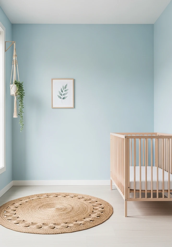
A nursery showcases walls in Bluebell Whisper pale blue, complemented by a light wood crib and a natural woven rug.
Bluebell Whisper is a soft, natural, very light blue with a subtle hint of green, capturing the essence of a blooming bluebell field. This shade feels organic and serene, bringing the tranquility of nature indoors. It is a gentle color that promotes a sense of peace.
This natural hue is excellent for nurseries, sunrooms, or any space where a connection to the outdoors is desired. It pairs wonderfully with light wood furniture, woven baskets, and natural fiber rugs, creating a harmonious and earthy aesthetic. It provides a calming backdrop for a truly restful environment.
18. Dewdrop Blue: Fresh and Sparkling

A bright breakfast nook features walls painted in Dewdrop Blue, a fresh pale blue, with a white table and clear acrylic chairs.
Dewdrop Blue is a fresh, sparkling, very pale blue, almost translucent, as if reflecting morning dew. This shade is exceptionally clean and bright, bringing a sense of crispness and new beginnings to a room. It has a lively quality that is still very subtle.
This refreshing hue is perfect for bathrooms, entryways, or even a bright breakfast nook. It pairs beautifully with glossy white tiles, clear glass accents, and polished silver hardware, creating a pristine and invigorating space. From my perspective, this color is ideal for areas where you want to feel refreshed and awake.
19. Ethereal Blue: The Ultimate Serene Shade
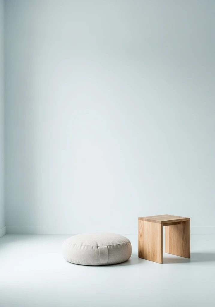
A minimalist meditation room showcases walls in Ethereal Blue, the lightest pale blue, with a simple floor cushion.
Ethereal Blue is the lightest, most subtle, and almost spiritual pale blue, representing the purest form of this calming hue. This shade is barely perceptible, creating an atmosphere of profound tranquility and weightlessness. It is the epitome of understated elegance and peace.
This ultimate serene hue is best utilized in meditation spaces, minimalist bedrooms, or any area dedicated to quiet contemplation. It pairs perfectly with organic textures, soft lighting, and monochromatic decor, allowing its subtle presence to truly shine. This color fosters an environment of complete calm and introspection.
Design Comparison: What to Expect with Pale Blue
| Style/Type | Key Features | Best For |
|---|---|---|
| Modern Minimalist | Clean lines, stark white accents, geometric forms | Contemporary apartments, small spaces, offices |
| Coastal Retreat | Natural textures, weathered wood, sandy neutrals | Beach houses, sunrooms, relaxed living areas |
| Traditional Elegance | Classic furniture, warm wood tones, subtle patterns | Formal living rooms, dining rooms, master bedrooms |
| Bohemian Chic | Layered textiles, eclectic decor, natural materials | Artistic spaces, cozy nooks, eclectic bedrooms |
| Scandinavian Serenity | Light wood, functional design, hygge elements | Bedrooms, living rooms, bright open spaces |
How to Choose Your Perfect Pale Blue Shade
Selecting the ideal pale blue involves several considerations to ensure it complements your home’s existing aesthetic and desired mood. First, consider the natural light in your room; a north facing room might benefit from a pale blue with warmer undertones to counteract cool light, while a south facing room can handle cooler blues. Always observe how the color appears throughout the day under different lighting conditions.
Next, think about the existing fixed elements in your space, such as flooring, trim, and large furniture pieces. Your chosen pale blue should harmonize with these elements, either by providing a gentle contrast or by blending seamlessly. Bringing home several paint samples and observing them on your walls for a few days is a crucial step before making a final decision.
Consider the overall mood you wish to create in the room. If you are aiming for a crisp, clean feel, opt for blues with gray or icy undertones, like Morning Frost or Arctic Light. For a softer, more calming atmosphere, shades with subtle green or violet hints, such as Coastal Haze or Pale Periwinkle, will be more suitable. The psychological impact of color is significant, so choose thoughtfully.
Finally, do not underestimate the power of complementary colors and textures. Pale blues pair beautifully with natural materials like wood, linen, and woven fabrics, as well as metallic accents in silver or gold. Introducing these elements can enhance the chosen pale blue, adding depth and interest to your design scheme without overwhelming the delicate hue.
Common Mistakes to Avoid When Using Pale Blue
One common mistake when incorporating pale blue is neglecting to test the color in your specific environment before painting an entire room. Pale blues can dramatically shift in appearance based on natural and artificial light, making a shade that looked perfect in the store appear completely different on your walls. Always paint large swatches on different walls and observe them over one to two days to see their true character.
Another pitfall is pairing pale blue with too many dark or heavy elements, which can make the delicate blue feel overwhelmed or out of place. While contrast is important, an excessive amount of dark furniture or bold patterns can detract from the serene quality of pale blue. Aim for a balanced approach, using darker tones sparingly as anchors rather than dominant features.
Underestimating the undertones of your chosen pale blue can also lead to an undesirable outcome. A pale blue with a strong green undertone might clash with existing purple accents, for instance, leading to an unbalanced look. Pay close attention to these subtle nuances to ensure harmony with other colors and finishes in your space.
Finally, avoid using pale blue in a room that lacks sufficient light, as this can make the color appear dull or even muddy rather than bright and expansive. Pale blues thrive in well lit environments where their subtle qualities can truly shine. If your room is naturally dim, consider enhancing artificial lighting or opting for a pale blue with a higher light reflectance value to maintain its vibrancy.
Frequently Asked Questions
What colors pair well with very pale blue?
Very pale blue pairs beautifully with a wide range of colors, especially neutrals like crisp white, soft grays, and sandy beiges. For a touch of warmth, consider blush pinks or light corals, while deeper navy or emerald green can provide sophisticated contrast. Natural wood tones, from light maple to rich walnut, also create a harmonious balance.
Can pale blue make a room feel cold?
While pale blue is inherently a cool color, it does not necessarily make a room feel cold if used thoughtfully. To prevent a chilly sensation, pair it with warm lighting, cozy textures like wool or velvet, and natural wood elements. Choosing a pale blue with subtle green or gray undertones can also add a touch of warmth and softness.
Is pale blue suitable for all room types?
Yes, pale blue is remarkably versatile and can be suitable for almost any room type, from bedrooms and bathrooms to kitchens and living areas. Its calming and expansive qualities make it excellent for creating serene retreats, while its refreshing nature works well in more functional spaces. The key is to select the right shade of pale blue and pair it with appropriate decor for the room’s purpose.
How does lighting affect pale blue paint?
Lighting significantly impacts how pale blue paint appears throughout the day. Natural light, especially from north facing windows, can make pale blues appear cooler and sometimes grayer. South facing light tends to warm up blue tones, while artificial lighting, depending on its temperature, can alter the color’s perception. Always test paint samples in your room to see how the color changes under various lighting conditions before committing.
Conclusion
Embracing the delicate beauty of very pale blue shades can profoundly transform your living spaces, imbuing them with serenity, sophistication, and a sense of expansive calm. From the crispness of Morning Frost to the ethereal whisper of Sky Mist, each hue offers a unique opportunity to craft a truly personalized environment. By understanding their nuances and applying expert insights, you can confidently select the perfect pale blue to enhance your home. Let these exquisite colors inspire a fresh, tranquil aesthetic that reflects your personal style and promotes well being.