Top 15 Creamy White Paint Colors for a Timeless Home Design

Overview
This article explores the top 15 creamy white paint colors, offering in depth analysis of their undertones, versatility, and best applications. Perfect for homeowners, designers, and DIY enthusiasts, you will discover how to select the ideal warm white for your space, learn to avoid common color mistakes, and gain expert insights to achieve a sophisticated, timeless look. Transform your interiors with confidence and elevate your home’s ambiance.
Key Takeaways
- Creamy whites offer unparalleled versatility and warmth compared to stark whites.
- Understanding undertones like yellow, beige, or greige is crucial for selecting the right shade.
- Always sample paint colors in your home’s unique lighting conditions before committing.
- Consider how natural and artificial light interacts with the paint throughout the day.
- The right creamy white can enhance design flexibility and create a timeless appeal.
Choosing the perfect paint color can be a transformative experience for any home, setting the stage for every design element that follows. Among the vast spectrum of whites, creamy white paints stand out for their incredible ability to infuse warmth, depth, and a welcoming ambiance into any room. From designing hundreds of spaces, I have observed how these nuanced shades offer a comforting alternative to cooler, starker whites, creating a soft backdrop that enhances various decor styles without overwhelming them.
This comprehensive guide will walk you through 15 of the most beloved and versatile creamy white paint colors available today. You will discover the unique characteristics, subtle undertones, and ideal applications for each shade, along with practical tips to help you make an informed decision. Get ready to explore the world of warm whites and find the perfect hue to elevate your living spaces, ensuring a timeless and inviting aesthetic that truly feels like home.
1. Benjamin Moore White Dove OC-17

This traditional living room showcases soft creamy white walls, complemented by a plush beige sofa and a classic dark wood coffee table.
Benjamin Moore White Dove is a beloved, soft white with a touch of gray and a hint of warmth, making it incredibly versatile. It avoids feeling too stark or too yellow, striking a beautiful balance that complements a wide range of materials and finishes. This shade works wonderfully with both traditional and contemporary aesthetics, providing a clean yet inviting foundation for any room.
This particular white is perfect for trim, cabinets, and walls, offering a sophisticated backdrop that allows other colors and textures to shine. Design experts at Benjamin Moore often recommend it for its ability to reflect light beautifully without feeling cold, creating a bright and airy atmosphere in any space.
2. Sherwin-Williams Alabaster SW 7008

A modern bedroom features warm creamy white walls, a light wood bed frame, and crisp white linen bedding for a serene look.
Sherwin-Williams Alabaster is a gentle, off white color with warm, creamy undertones that evoke a sense of calm and comfort. It was named Color of the Year in the past, highlighting its timeless appeal and broad compatibility with various design styles. This shade is particularly favored for its ability to create a soft, inviting glow without appearing overly yellow or starkly white.
Alabaster is an excellent choice for creating a serene atmosphere in bedrooms, living areas, and even exterior applications. Its subtle warmth makes it ideal for spaces where you want to feel relaxed and at ease, pairing beautifully with natural wood tones, muted greens, and soft blues for a harmonious color palette.
3. Farrow & Ball Wimborne White No. 239

This elegant kitchen showcases pure creamy white cabinetry, complemented by luxurious marble countertops and gleaming brass hardware.
Farrow & Ball Wimborne White is a pure, warm white without any cool undertones, providing a soft and elegant backdrop. It is known for its incredible depth and ability to make a room feel both spacious and incredibly inviting. This shade avoids any hint of yellow, instead offering a clean, gentle creaminess that feels luxurious and refined.
This sophisticated white is perfect for creating a classic, timeless aesthetic in any room, from kitchens to formal living areas. It pairs exceptionally well with muted pastels, deep jewel tones, and natural textures, allowing them to truly pop while maintaining a cohesive and polished look throughout your home.
4. Benjamin Moore Swiss Coffee OC-45

A cozy open concept living area features warm creamy white walls, a large sectional sofa, and exposed wooden beams.
Benjamin Moore Swiss Coffee is a popular creamy white with a noticeable warmth, leaning slightly towards a soft beige or very light greige. This beautiful shade offers a welcoming and cozy feel, making it a favorite for those who want a white that never feels cold or stark. Its subtle depth allows it to hold its own without disappearing on the walls.
It is an excellent choice for open concept living spaces where you want a consistent, warm flow between rooms, or for north facing rooms that need extra warmth. Swiss Coffee pairs beautifully with natural elements like wood, rattan, and linen, creating a relaxed and inviting atmosphere that feels effortlessly chic.
5. Sherwin-Williams Pure White SW 7005

A bright modern dining room features crisp creamy white walls, a light wood dining table, and minimalist seating.
Sherwin-Williams Pure White is a bright, clean white with just the slightest touch of warmth, making it a highly versatile and popular choice. It is often described as a true white that avoids harsh blue or gray undertones, instead offering a soft, almost imperceptible creaminess. This shade is perfect for achieving a crisp yet inviting look.
This white is ideal for ceilings, trim, and as a primary wall color in spaces where you desire brightness without sterility. It provides a fantastic canvas for vibrant artwork and colorful furnishings, ensuring they pop against a neutral background. Pure White is a go to for creating a fresh and timeless aesthetic in any room.
6. Behr Swiss Coffee 12Y3

This warm nursery features walls painted in a rich creamy white, complemented by a natural wood crib and a soft textured rug.
Behr Swiss Coffee is a deeply warm and inviting creamy white with noticeable yellow and beige undertones, offering a truly cozy feel. This shade is richer than some other creamy whites, providing a sense of depth and comfort that can transform a cold room into a welcoming sanctuary. It is a fantastic option for those who want a white that distinctly feels warm.
This color is particularly well suited for creating a comfortable and lived in atmosphere in family rooms, nurseries, or bedrooms. It pairs beautifully with earthy tones, rustic decor, and soft textiles, enhancing a relaxed and natural aesthetic. Behr’s version of Swiss Coffee is a dependable choice for adding significant warmth.
7. Benjamin Moore Simply White OC-117

A bright contemporary kitchen features clean creamy white cabinets, stainless steel appliances, and a large window.
Benjamin Moore Simply White is a clear, bright white that carries a subtle hint of yellow, giving it just enough warmth to feel inviting without appearing overly creamy. It was named Color of the Year, a testament to its broad appeal and ability to brighten spaces while maintaining a soft edge. This shade is celebrated for its clean and crisp appearance.
Simply White is frequently used on trim, ceilings, and as a wall color in contemporary and transitional homes. It works exceptionally well in rooms with abundant natural light, where it can truly shine and enhance the feeling of spaciousness. This color offers a fresh and modern backdrop that supports a wide array of design choices.
8. Sherwin-Williams Dover White SW 6385

This traditional living room features warm creamy white walls, a classic fireplace, and elegant dark wood furniture.
Sherwin-Williams Dover White is a warm, creamy white with distinct yellow undertones, creating a very cozy and traditional feel. This shade is perfect for those who desire a white that is undeniably warm and comforting, reminiscent of aged linen or antique lace. It avoids any gray or cool notes, offering pure, gentle warmth.
Dover White is an excellent selection for traditional style homes, kitchens with classic cabinetry, or any space where you want to evoke a sense of heritage and comfort. It pairs beautifully with darker wood tones, brass fixtures, and rich fabrics, contributing to a timeless and inviting interior. This color adds significant character and warmth.
9. Benjamin Moore Cloud White OC-130

A light and airy coastal bedroom showcases soft creamy white walls, white-washed furniture, and inviting blue and white bedding.
Benjamin Moore Cloud White is a soft, airy white with subtle yellow and beige undertones, creating a gentle and inviting atmosphere. It is known for its ability to soften a space without making it feel dull or heavy, offering a light and ethereal quality. This shade is highly popular for its delicate balance of warmth and brightness.
Cloud White is an ideal choice for walls, trim, and ceilings, particularly in spaces that benefit from a feeling of openness and tranquility. It complements a wide array of color palettes, from coastal blues to earthy greens, making it a versatile foundation for diverse design styles. This color truly feels like a soft cloud.
10. Sherwin-Williams Shoji White SW 7042

An organic modern living room features earthy creamy white walls, a large natural wood console, and lush green plants.
Sherwin-Williams Shoji White is a sophisticated off white with noticeable beige and gray undertones, giving it a complex and earthy creaminess. This shade offers more depth than a typical white, providing a cozy and grounding feel without being overly dark. It is often described as a warm greige that leans significantly towards white.
Shoji White is fantastic for creating a calm and organic aesthetic, especially when paired with natural materials like wood, stone, and linen. It works beautifully in open concept homes, providing a cohesive and warm backdrop that transitions smoothly between different areas. This color brings a touch of understated elegance to any interior.
11. Farrow & Ball Pointing No. 2003

This historic traditional hallway showcases very warm creamy white walls, complemented by dark wood wainscoting and vintage furnishings.
Farrow & Ball Pointing is a very warm and traditional creamy white, named after the color of traditional mortar. It has a high level of yellow pigment, giving it a distinctly aged and inviting feel without appearing overtly yellow. This shade is celebrated for its ability to create a soft, historic warmth in any space.
Pointing is an excellent choice for period homes or for creating a classic, cozy atmosphere in more contemporary settings. It pairs wonderfully with antique furniture, rich fabrics, and natural light, making a room feel both grand and intimately comfortable. This color truly envelops a space in gentle warmth.
12. Benjamin Moore Linen White OC-146

A cozy traditional bedroom features walls painted in a soft linen white, an upholstered headboard, and layered, inviting bedding.
Benjamin Moore Linen White is a soft, inviting white with a noticeable touch of beige and yellow, giving it a natural, fabric like warmth. It is a classic choice that provides a comforting backdrop without feeling overly bright or stark. This shade is admired for its subtle richness and ability to create a cozy atmosphere.
Linen White is particularly effective in bedrooms, living rooms, and dining areas where a gentle, enveloping warmth is desired. It harmonizes beautifully with natural textures, muted color palettes, and both dark and light wood tones. This color offers a timeless appeal, making any room feel instantly more welcoming and serene.
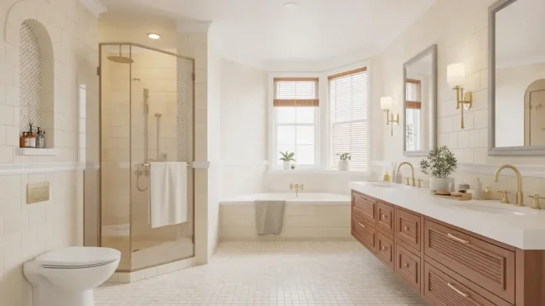
13. Valspar Bistro White 7006-24
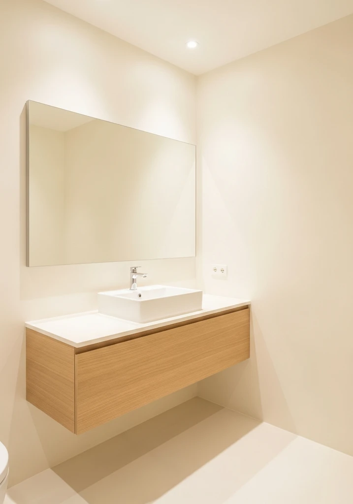
A bright modern bathroom showcases crisp creamy white walls, a sleek floating wood vanity, and a large, reflective mirror.
Valspar Bistro White is a clean and crisp creamy white with subtle, almost undetectable warm undertones, making it highly adaptable. It provides a fresh and bright appearance without feeling cold, offering a perfect balance between a true white and a softer cream. This shade is a reliable choice for achieving a luminous yet inviting look.
This versatile white is well suited for modern and transitional spaces, particularly in kitchens and bathrooms where a clean aesthetic is paramount. It works beautifully with both cool and warm accents, allowing for significant design flexibility. Bistro White is an excellent option for those seeking a bright white that retains a hint of softness.
14. Sherwin-Williams Aesthetic White SW 7035

This refined home office features sophisticated creamy white walls, a dark wood desk, a comfortable leather chair, and ample built in shelving.
Sherwin-Williams Aesthetic White is a sophisticated off white with a balanced blend of beige and gray undertones, creating a very light greige that reads as a warm white. This shade offers more body than a pure white, providing a comforting depth that makes a room feel enveloped and serene. It is a fantastic choice for those who appreciate subtle complexity.
Aesthetic White is ideal for creating a calm and refined atmosphere in living rooms, offices, or hallways, especially when paired with natural textures and understated decor. Its balanced undertones make it adaptable to various lighting conditions, ensuring it looks beautiful throughout the day. This color embodies a quiet elegance that enhances any space.
15. Benjamin Moore Pale Oak OC-20

A versatile transitional living room showcases warm creamy off white walls, a blend of modern and traditional furniture, and layered textiles.
Benjamin Moore Pale Oak is a popular greige color that often reads as a warm, creamy off white, especially in well lit spaces. It has subtle pink, beige, and gray undertones that give it incredible depth and a soft, inviting quality. This shade is a chameleon, shifting beautifully with the changing light throughout the day.
Pale Oak is an excellent choice for a whole house color palette due to its remarkable versatility and ability to complement almost any decor style. It works well in both bright and dimly lit rooms, bringing warmth without overwhelming the space. This color offers a sophisticated neutrality that enhances any interior design.
Design Comparison: What to Expect
| Style/Type | Key Features | Best For |
|---|---|---|
| Modern Minimalist | Clean lines, bright but soft, subtle warmth, expansive feel | Contemporary homes, open concept layouts, maximizing natural light |
| Traditional Elegant | Rich warmth, classic depth, inviting and cozy, heritage feel | Period homes, formal living spaces, pairing with antique furniture |
| Farmhouse Rustic | Earthy undertones, comforting, natural and organic feel | Country style homes, spaces with natural wood and textured fabrics |
| Coastal Breezy | Light and airy, slightly crisp, hints of sand and shell tones | Beach houses, bright informal spaces, complementing blues and greens |
| Transitional Versatile | Balanced warmth, adaptable undertones, bridges different styles | Homes with mixed decor, flexible spaces, whole house color schemes |
How to Choose Your Perfect Creamy White Paint
Selecting the ideal creamy white paint begins with understanding your room’s natural light. North facing rooms often benefit from warmer whites to counteract cooler light, while south facing rooms can handle cooler creamy whites without feeling sterile. Observe how the light shifts throughout the day, as this significantly impacts how the color appears on your walls.
Next, consider the existing fixed elements in your space, such as flooring, cabinetry, and tile. The undertones in these elements should harmonize with the undertones of your chosen creamy white paint. For instance, if your flooring has warm, yellow tones, a creamy white with similar undertones will create a cohesive and pleasing aesthetic.
Always sample your chosen paint colors directly on your walls, not just on small swatches. Paint large patches in different areas of the room and live with them for a few days to see how they look in various lighting conditions and at different times. This crucial step helps prevent costly mistakes and ensures you are truly happy with your final selection.
Finally, think about the overall mood and function of the room. A cozy bedroom might benefit from a deeper, more saturated creamy white, while a bright kitchen could thrive with a cleaner, slightly crisper creamy white. Matching the paint’s personality to the room’s purpose will enhance the overall ambiance and design.
Common Mistakes to Avoid When Choosing Creamy White Paint
A common mistake is neglecting to identify the paint’s undertones, which can lead to unexpected results. A creamy white might have subtle yellow, pink, gray, or green undertones that can clash with your existing decor if not carefully considered. Always test samples to see how these undertones reveal themselves in your specific lighting conditions.
Another frequent error is failing to paint large enough swatches on your walls before making a decision. Small paint chips often do not accurately represent how a color will look on a grand scale, particularly with whites and off whites. Investing in larger sample boards or painting sizable sections allows you to truly visualize the color’s impact.
Many homeowners also make the mistake of not testing the paint color at different times of day. What looks perfect in bright morning light might appear entirely different under evening artificial lighting or on a cloudy afternoon. Take the time to observe your samples under various lighting scenarios to ensure satisfaction.
Lastly, avoid choosing a creamy white solely based on how it looks in someone else’s home or online. Every space has unique lighting, existing finishes, and decor that will influence how a paint color appears. Trust your own observations from in home testing rather than relying solely on inspirational images.
Frequently Asked Questions
What is the difference between a creamy white and a true white?
A creamy white typically has warm undertones, often appearing slightly yellow, beige, or greige, giving it a soft and inviting feel. In contrast, a true white is starker and brighter, with minimal to no discernible undertones, providing a crisp and clean aesthetic. Creamy whites tend to feel cozier and more traditional, while true whites often lean modern.
How do I know which creamy white undertone is right for my home?
To determine the right undertone, observe your fixed elements like flooring, countertops, and existing furniture. If these elements have warm, yellow, or orange tones, a creamy white with similar undertones will create harmony. If your existing decor leans cooler with grays or blues, a creamy white with a subtle greige or less pronounced yellow undertone might be a better fit to avoid clashes.
Can creamy white paint make a room look smaller?
Generally, creamy white paint, especially lighter shades, tends to make a room feel larger and more open by reflecting light. However, if you choose a creamy white that is too dark or has very strong yellow or beige undertones for a small, poorly lit room, it could potentially make the space feel less expansive. Opt for a creamy white with a higher Light Reflectance Value (LRV) in smaller areas.
Is creamy white paint a good choice for kitchen cabinets?
Yes, creamy white paint is an excellent choice for kitchen cabinets, offering a timeless and warm alternative to stark white. It provides a soft backdrop that pairs well with various countertop materials, backsplash tiles, and hardware finishes. A creamy white can create a cozy and inviting kitchen atmosphere, enhancing both traditional and transitional designs with its subtle warmth.
How does artificial light affect creamy white paint colors?
Artificial light significantly impacts how creamy white paint appears. Incandescent bulbs tend to amplify yellow and red undertones, making creamy whites appear warmer and more yellow. LED lights, depending on their color temperature (warm white to cool white), can either enhance the warmth or make a creamy white appear slightly cooler or more neutral. Always test your samples with your room’s primary artificial lighting.
Conclusion
The world of creamy white paint offers an exquisite spectrum of warmth and sophistication, capable of transforming any space into an inviting sanctuary. By understanding undertones, sampling diligently, and considering your home’s unique lighting, you can confidently select a shade that perfectly complements your style. These 15 top creamy whites provide a fantastic starting point for creating interiors that are both timeless and deeply personal. Embrace the versatility and enduring appeal of creamy white to craft a home that feels truly yours, filled with warmth and quiet elegance.